Is This a House or a Fortress Ready to Be Defended?
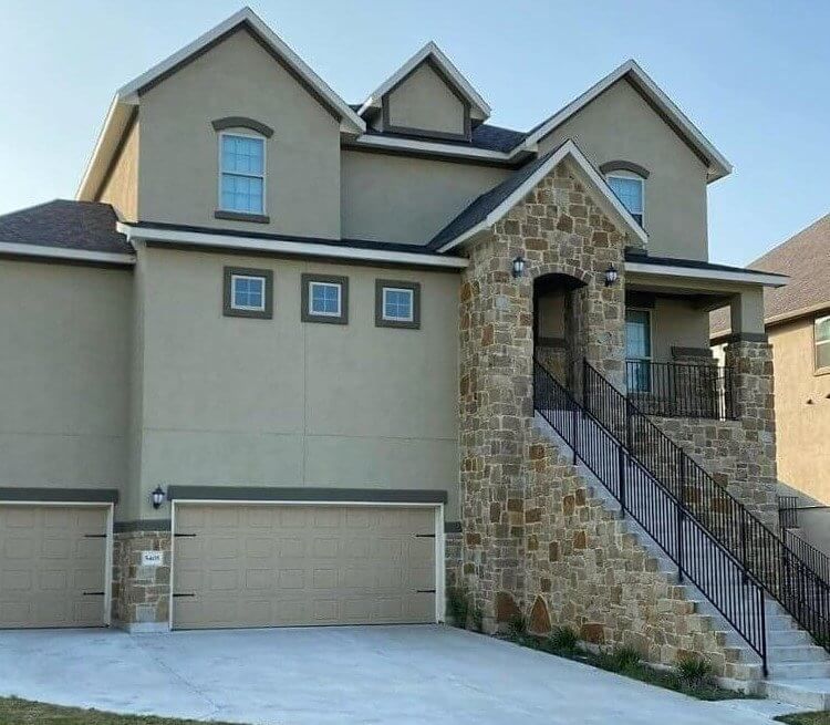
While this house looks normal at a glance, looking for more than a second lets you really take in the weird, smaller details. Firstly, the massive and frankly excessive staircase gives you a small workout whenever you want to enter or exit your house. Bringing things in or out of the house only worsens that entire ordeal. Not only that, but the tiny windows are also very strange. Overall, the house seems like a small fort, with small embrasures and a moat.
The moat aspect might not be entirely untrue, either. Depending on where this house was built, it might have been made as tall as it is if it's a common flood area.
As If Stairs In Rush Hour Weren't Bad Enough
Using the metro can already be stressful enough. People are always rushing to catch their train, and it's always cramped and busy. The stairs can be pretty scary for those of us who aren't the most surefooted. That's why handrails are essential. They're meant to help you safely up and down staircases, so that begs the question of what the designers were thinking when it came to this Shanghai Metro staircase.
These handrails are more likely to cause an injury than prevent one. But at least if you bring along a toy skateboard, you can have some fun going up and down the ramps.
Sometimes, People Realize Too Late the Prank That's Being Pulled
The designer for this health center must have cackled with glee as the building came closer and closer to being fully erected. At least, one can only hope this was intentional. If this was purely an accident, then the designer probably needs to take a step back to reevaluate. Hopefully, the different wings and wards are all appropriately placed. Otherwise, it really would be a missed opportunity.
While we needn't state the obvious about this strange design, we can at least enjoy it from afar and hope there's a closer health center the next time we're in trouble.
Ever Wondered What Those Unreachable Windows and Dust Shelves Were Really For?
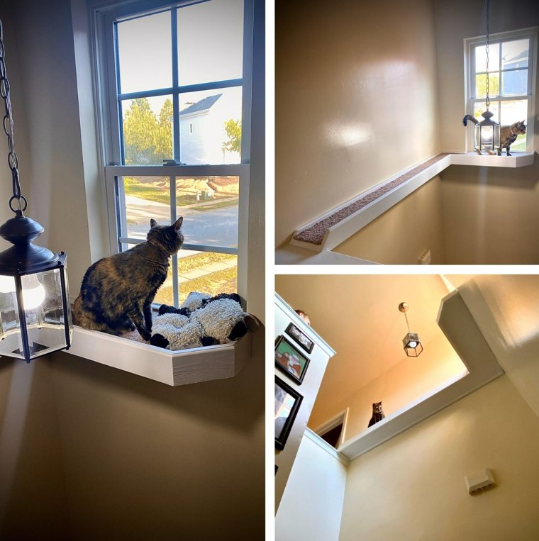
Sometimes, you see a design aspect and wonder, "Just why?" Plenty of cases exist, such as dust shelves and seemingly operable windows in strange spots. As it turns out, the designers must be big fans of cats since they're perfect little hideaways and pathways. While it may be a bit alarming to suddenly have a toy drop from above and see tiny pinpricks in the dark staring from above, most cat owners are probably used to it.
There is still the question of how one goes about cleaning up there, though. Do you have to get a ladder each time? What if there isn't space for the ladder on the stairs? These are questions to keep you up at night.
Color Theory Is Not Saving This One
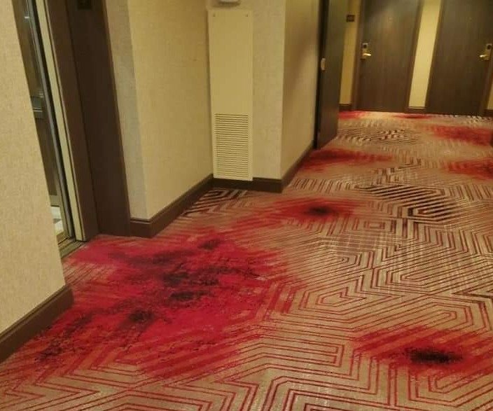
By now, most people are likely familiar with the color theory concept that red is associated with warmth, health, comfort, and healing. That being said, there is no escaping the fact that blood is red, and sometimes, red designs aren't as appealing because of it. These carpet designs take that to the next level. Does the designer get a kick out of knowing that every time a new visitor steps into the hallway for the first time, they get scared out of their skin?
There isn't any one way you could really spin this: It looks like there are some bloodstains as if this were a scene from a really violent true crime series. It could be wine stains.
Sometimes Feeling Fancy Just Isn't Worth It
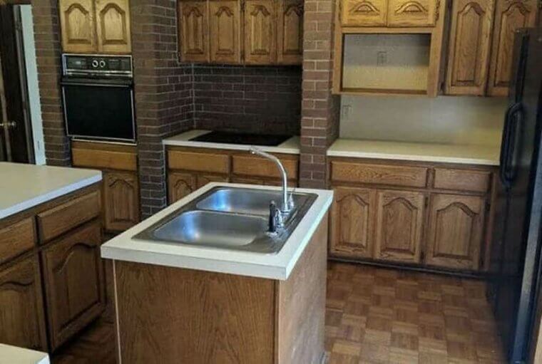
The craze of wanting an island in your kitchen may not be as prevalent nowadays, but some still cling to the idea. While having an island with a sink and some space to gather around with friends and family may be nice, this is just impractical. Not only is it in the way, but you must ask: What happens to all the dishes you hand wash? Where do they go to dry?
While the overall kitchen design is evocative of 70s designs, some things are probably best left in the past. And possibly knock out some randomly placed brick walls.
Modern Problems Require Modern Solutions
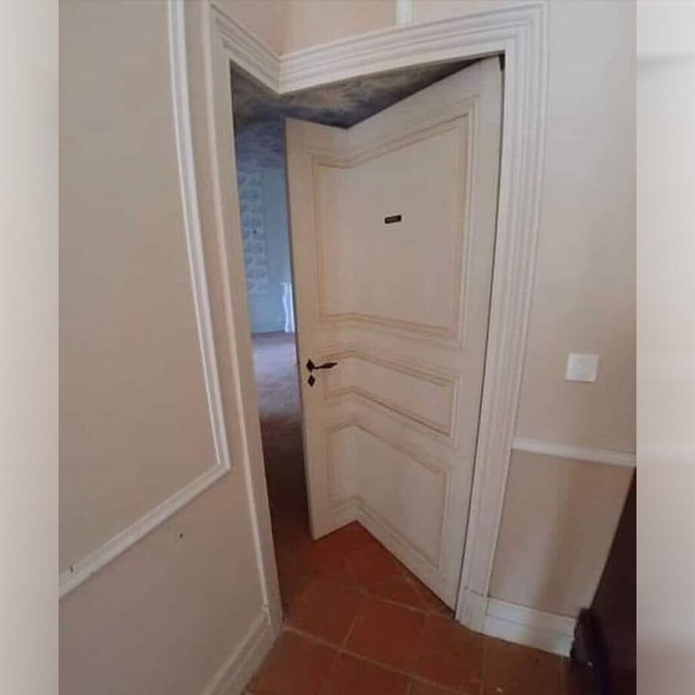
If there were ever a good reason to hire a professional architect, it would be this. Finding out a doorway doesn't precisely fit into the room plans after all the walls have gone up is definitely not something you want to happen. Corner doors are pretty neat and can do a lot to change up the shape of a room, but this is undoubtedly one of the more eccentric ways of making one.
At the end of the day, if it works, it works. It certainly isn't the worst design in the world and might even be quirky and different enough for people to like it.
Whatever's Up These Stairs Probably Isn't Worth The Risk
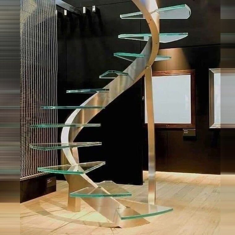
When it comes to staircases, designers tend to go a bit crazy with the form and often forget their function. While these might be nice to look at, actually using them is a whole other story. Glass stairs on their own already give people anxiety, but not having any handrails, making them a tight spiral, and designed with an irregular shape? That's asking for someone to have a bad fall.
Thankfully, this seems like a decorative piece rather than a functional staircase. But you have to wonder what the original design intent must have been.
Balconies Aren't Always What They're Cracked Up to Be
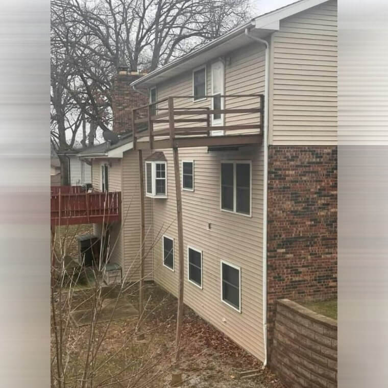
And speaking of cracking up, this third-story wooden balcony with only two thin wooden stilts to prop it up is probably asking for trouble. While it's nice to have a deck that was maybe built using your own two hands, there's a reason professionals are trained to follow safety regulations. The bowing of those stilts doesn't inspire a lot of confidence that these will stand for very long, but at least they can enjoy it while they can.
At the end of the day, if someone wants a deck or a balcony for their third floor, this is just another example of why going through an architect is for the best.
Either Everything Is Marble, or the Designer Was Going Marbles to Get This Pattern
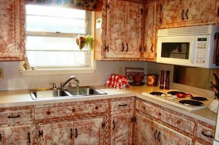
This kitchen has all kinds of wrongs. The most obvious is the design pattern of all the cupboards, which is either all marble and incredibly heavy or designed to look like a murder scene that couldn't really be cleaned up. While the design is very 90s DIY and unique, one has to wonder if the countertops were left bare because of a lack of material or because the designer said, "Enough is enough."
Having a kitchen that looks like it's made entirely of raw bacon is certainly a choice, but it's likely the least of their concerns, given the clearance between the stovetop and the microwave.
Some Designs Just Leave You Floored
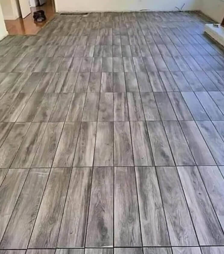
We all know somebody who will always recommend a friend who can do a job for cheaper, and sometimes, we choose to trust them. That's our first mistake, as unless that friend is a known and trusted professional, it's always safer to go with the trusted business. Nobody wants to end up with a strange floor design that's just begging to be poked fun at by the internet.
The best thing to do in this situation is to invest in some good carpeting and probably trust a professional to do it rather than a friend of a friend.
Bathroom Visits Will Certainly Be Quick Over Here
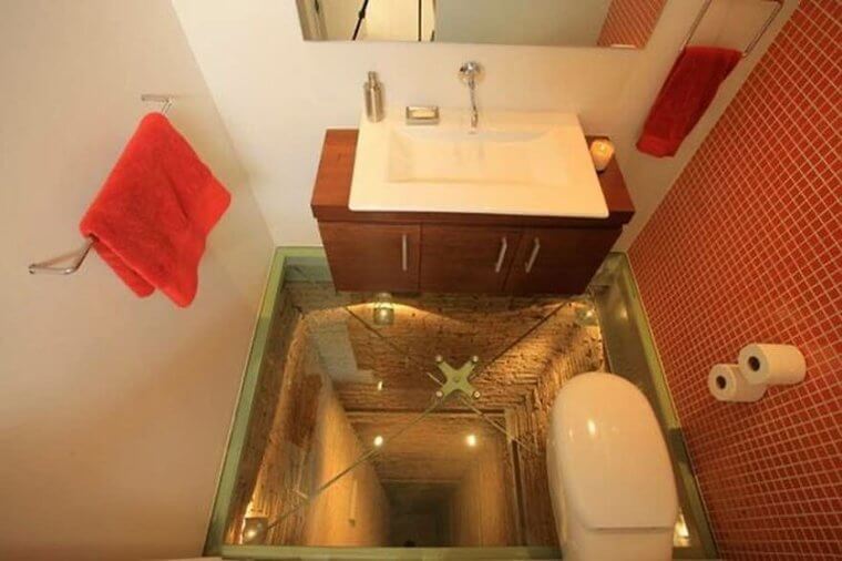
We're all for reusing and remodeling old aspects of buildings and making sure no space goes to waste, but repurposing an elevator shaft is pretty evil for anyone with a fear of heights. Thinking of the sheer terror it causes for people desperately needing the restroom, only to stumble into here, must put a smile on the designer's face at least a couple times a day. It's undoubtedly one of the flashier examples on this list.
Making sure the shaft below is reasonably well-lit is a nice choice on the designer's part, letting you know that it actually really is quite a way down.
For When You Really, Really Need A Room Well Lit
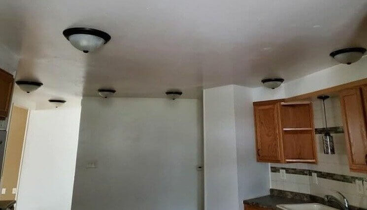
These infamously shaped lights are well known across the internet by now; clearly, someone was a big fan. However, how much lighting does one room really need? At what point does one question whether there are too many lights? When the power bill comes back at the end of the month? Or when they go out one after the other, and suddenly there are seven bulbs in a room that need changing?
While the design itself is pretty divisive, everyone can agree that most rooms of this size need two or three at max. Let's just hope there isn't a surge anytime soon.
The Perfect Office Nook for People Who Never Want to Work
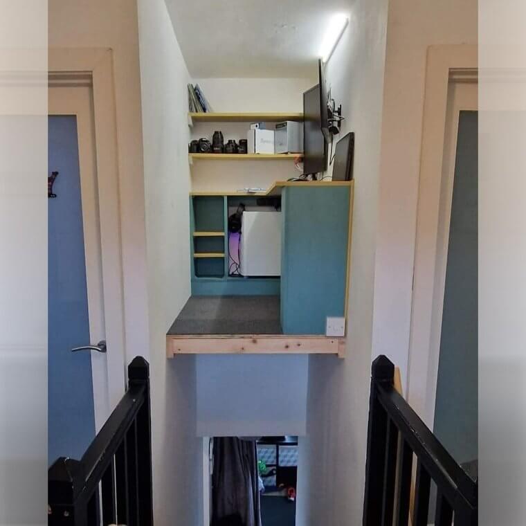
It's pretty easy to see why this is the perfect office nook for people who never want to work since it's literally impossible to get to this office. "Sorry, boss, I can't log in during work-from-home days because getting to my home office is life-endangering." We bet that's what this person texts their manager every work-from-home day. Seriously, what is the point of having this nook?
How do they get to it? Is there a special life-threatening bridge they put up every time they want to cross over the staircase to their desk? Or maybe there's a zipline?
You'll Need More Than a Simple Stool to Reach Those Cabinets
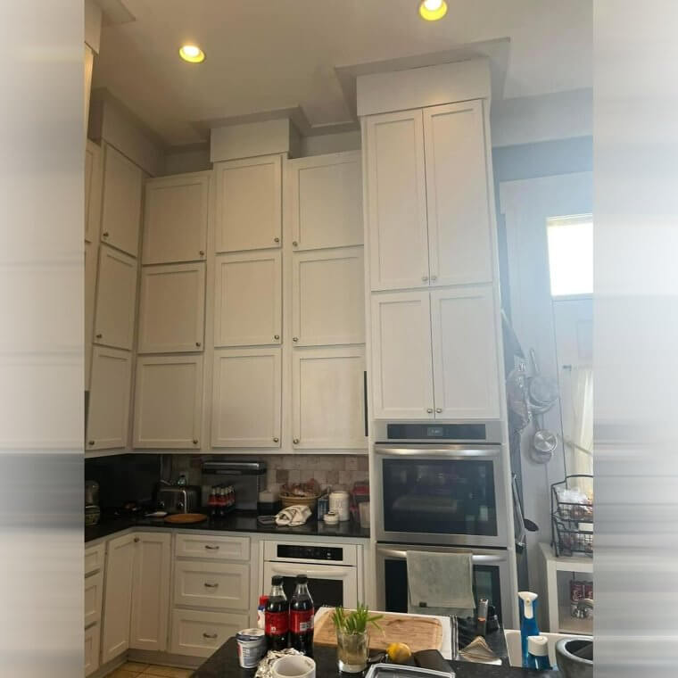
If you ask anyone who's unhappy with their kitchen why that is, chances are they'll answer you something like, "It's not spacious enough" or "There's not enough storage space." But if you ask this person why they don't like their kitchen, we bet their answer would be that there's too much storage, and the storage space is ridiculously inaccessible! Seriously, look at the height of those excessive cabinets!
We'd need a hard hat and a harness for safety anytime we reach for something up there. Oh, and a ten-foot ladder accessible at all times, of course.
So Many Doors Leading to... Nowhere?
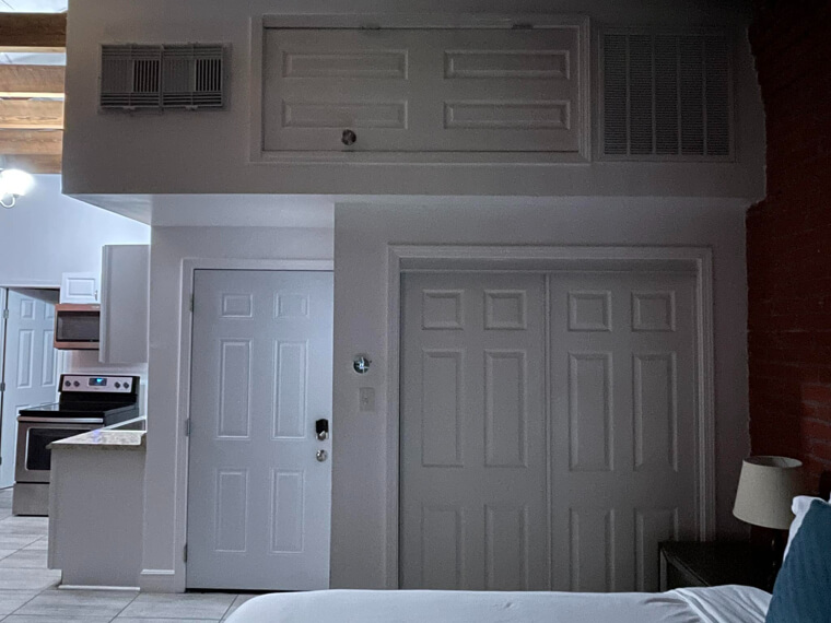
This is hands-down one of the more confusing items on this list. There are a total of five doors visible just from this one angle and two very large vents. We have so many questions. Are both of the vents functional? Where do all these doors lead to? Why is one of them sideways? Who designed this? Who lives here? Why? Unfortunately, we don't have any of the answers.
Maybe whoever put this together is a big fan of the classic cartoon film Monster's Inc. Maybe all these doors bring them back to that childhood fantasy land. Or maybe they were just being scrappy.
The Perfect House for Anyone Who Doesn't Want to Use Their Garage for Cars
At first glance, this home looks as good as can be. Cute architecture, nice window placements - it looks like your typical suburban home. Except for one small detail - the driveway leads to a dead end on the side of the house rather than to the garage. We guess this is only a problem if you planned to use the garage for, well, what it was intended for.
But if you don't have a problem leaving your car outdoors, whether there's rain, shine, snow, or natural disasters, then this might just be the perfect house for you!
No Baseboard, No Problem
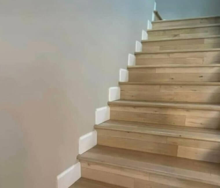
There's nothing more frustrating than seeing that someone had a good vision for something, yet a tiny detail completely messed the whole thing up. Whoever designed this staircase chose lovely flooring and a great color template for the walls/baseboards/floor. Truly, the vision here was good. But whoever they paid to install their baseboard got it completely wrong. What is going on here? We were so close to perfection.
And imagine the time and patience it took to cut baseboard pieces to fit each step like this. Imagine putting in all of that time and effort and still getting it so wrong.
They Wanted a Nice Deck but Ended up With This
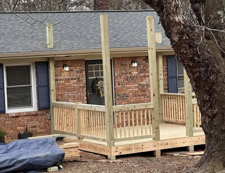
This is why it's so important to consult professionals before beginning any big project. What could have been a simple deck build turned into a messy and poorly done structure all because the amateurs were left in charge. Who even knows if they messed up the structural integrity of the house because of those wooden poles they decided could just be stuck through the room like that? We're guessing there were no permits involved in the making of this deck.
And if there were any permits involved in the making of this deck, this construction most likely violates whatever said permits detailed.
Is It Just Us or Is This House a Bit Tilted?
Yes, this house is completely tilted sideways. No, it is not some sort of building for a Ripley's Believe It or Not museum. It is a real person's home, but if we had to take a guess, we'd bet our money that they didn't consult the right professionals when planning and building this thing. And if they did, it's time they ask for their money back, wouldn't you say?
Not only is this a danger to the people who live in the tilted home, but it's also dangerous to all of their neighbors as well! And we don't even want to know how much fixing this is going to cost them.
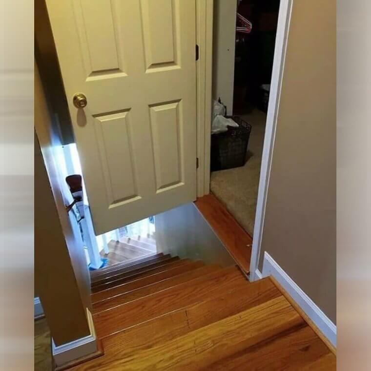
Those Impossible to Reach Doors on the Internet Are Fake, Right?
We've all seen pictures online before when there were doors far above where anyone would be able to reach. Still, it's entirely possible if the owners decide to skip out on quality architectural work. Not having a good designer to measure correctly and lay out the floor plan can lead to some strange occurrences, like doors not correctly lining up with where they're supposed to. Unfortunately, some people realize the mistake far too late and just have to make do.
This particular case takes "watch your step" to the next level. Let's just hope that this isn't someone's bedroom, and they work late nights and always come home exhausted.
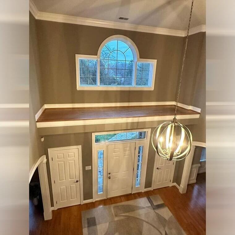
The Inaccessible Foyer
This is one of those things that you can look at but can't touch. And it's not because it's a super expensive and famous piece of art. No - you can't touch it because it's simply impossible unless you want to whip out a ladder every time. Yup, this foyer, if we can call it that, is totally useless above this home's front door. They could've just left the ceiling above the front door higher instead.
We're pretty sure whoever lives here would enjoy some high ceilings more than a useless little platform they can't safely access without a total hassle.
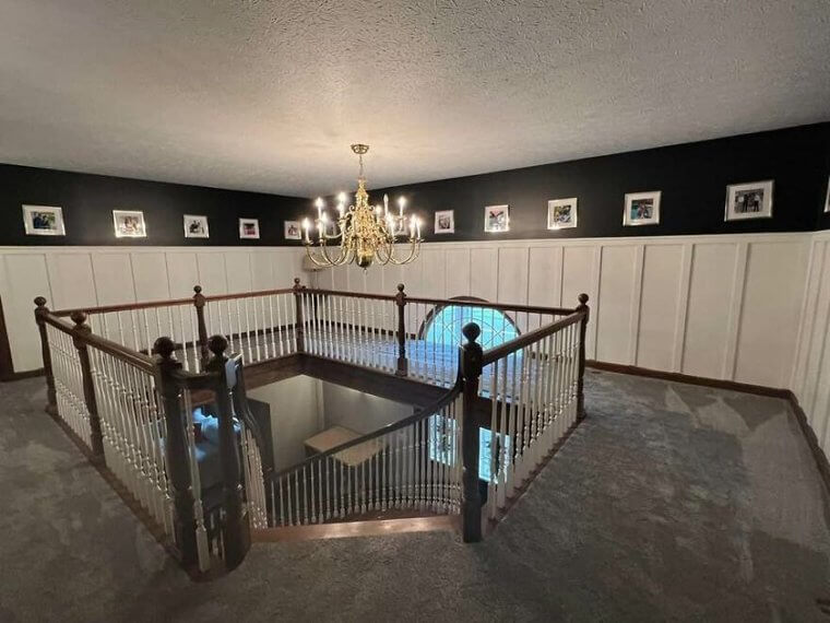
An Incomplete Foyer Makes a Perfect Racetrack for Toddlers
While the stairs may prove a safety hazard for the little ones, there are a few other ideas for what this space could be used for. Not only is the empty space difficult to really look at, but one also has to wonder if there was ever an idea of what should have gone there in the first place. Were there supposed to be rooms? Bookshelves? Some tables and displays with decor?
Whatever it may be, an empty foyer for a two-story staircase will probably only end up collecting dust, so hopefully, by now, the owners have filled the space out a bit.
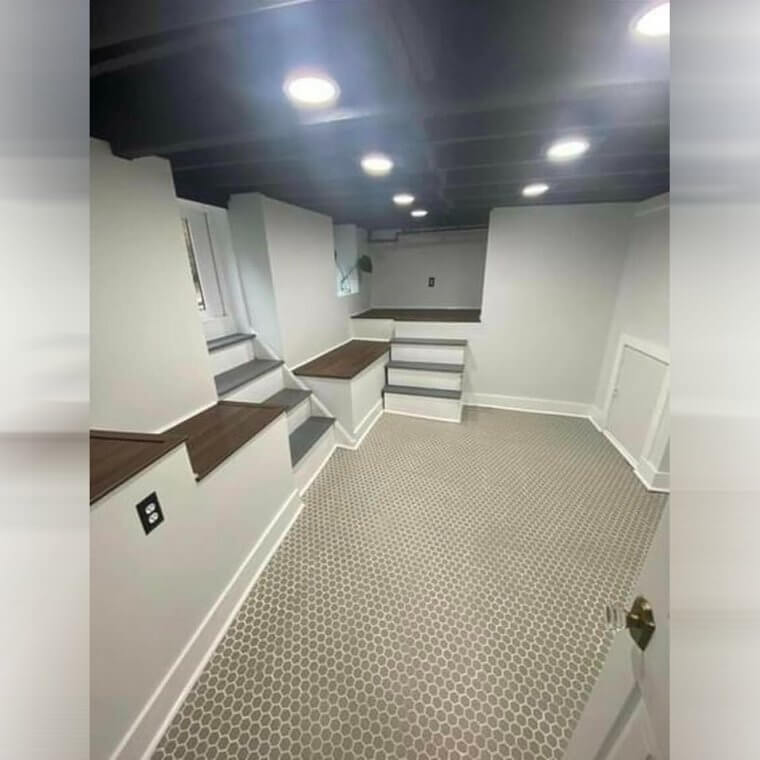
A Room for People Who Just Love Stairs
Do you have a passion for stairs? For little stairwells? Even ones that are totally useless and lead to nowhere real? Then this might be the perfect room for you! Just look at all those useless little sets of stairs leading to absolutely nowhere. And you have plenty of bright, bright lights on the ceiling to make sure you never miss a step! But seriously - what is the function of this room?
Who designed it, and why does it require so many little staircases? Are they covering something up? Please tell us they have a purpose, or we're going to go wild.
It's Nice That ADA Bathrooms Are Equipped To Provide Musical Accompaniment Nowadays
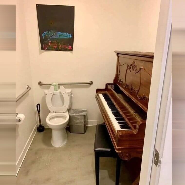
The Americans with Disabilities Act (ADA) is designed to prevent discrimination against people with disabilities, and this extends to ensuring buildings are constructed with disabled people's needs in mind. While this bathroom certainly looks like it's been designed accordingly, adding a whole piano really just defeats the entire purpose and makes it that much more difficult for disabled people to properly use the restroom. At least they can bring along a musician to keep them company.
Hopefully, the piano being stored here is just temporary, but it does open the opportunity for another kind of movement to be played here.
Cut Twice, Measure Once, Is How the Adage Goes... Or Does It?
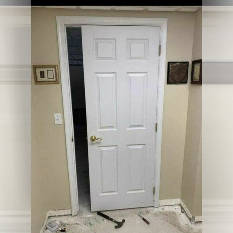
Not many people realize just how much variance there can be in the size of a door. While most doors are generally kept to around the same width, it's never a guarantee, and one should always double-check the door size to fit a frame properly. Otherwise, you'll end up in this situation. Whether the door is too big or small, it'll never properly close, and this way, you'll never truly have privacy either.
At least this way, you can be assured that your pets won't have to scratch at the base of the door to be let in at night.
This Renovation Leaves Us With so Many Questions
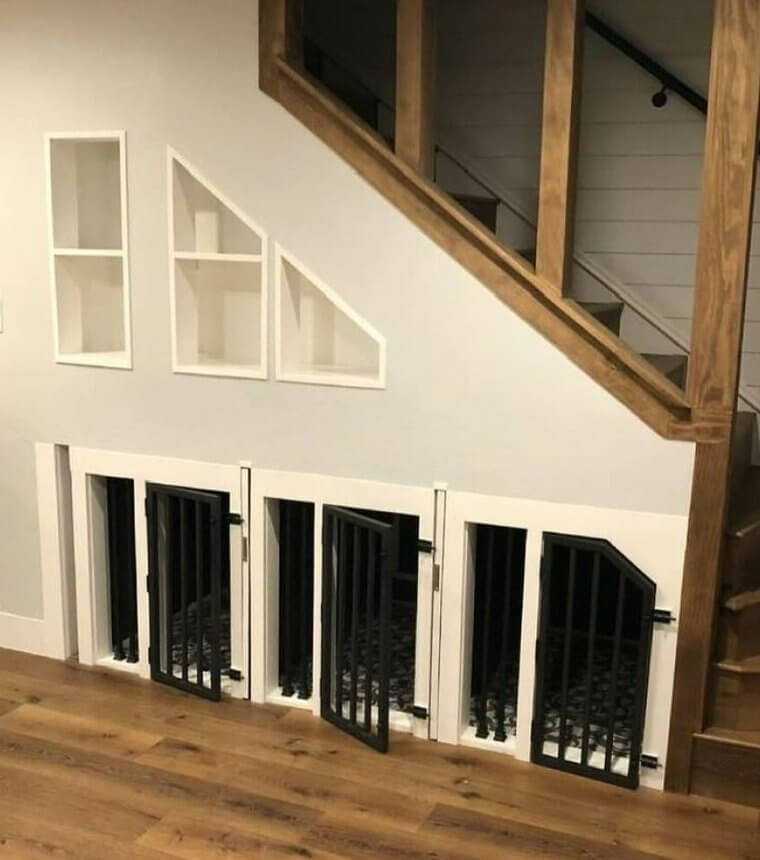
At first glance, there's nothing alarming about this photo. It looks like fresh paint and moldings galore. But a closer look reveals something else: strange and mismatched finishings, asymmetrical built-in shelves that make us feel uneasy, and the big elephant in the room: those cages. Is this an animal shelter or someone's home? And if it's a person's home, why do they have those dark cages under their staircase?
So, while at first glance we thought nothing, at second glance, we are suddenly seriously concerned. Who or what is being put in those cages, and why? We need answers.
Some People Never Left the Barn They Were Born In
Farmhouse-style homes and aesthetics are great and immensely popular, but some people end up pushing them a tad too far. With a bathroom design that's mostly metal and gray, at what point does the designer wonder if it's enough? While it's unique and suits somebody's tastes, one has to imagine what the bathtub must feel like on the skin, not to mention the heat that must radiate from the room in the summer.
That being said, some people like living life on the edge at all times, so who's to say that risking tetanus every time you go to the restroom is a bad thing?
Maybe the Owners Were Only Born Halfway in a Barn?
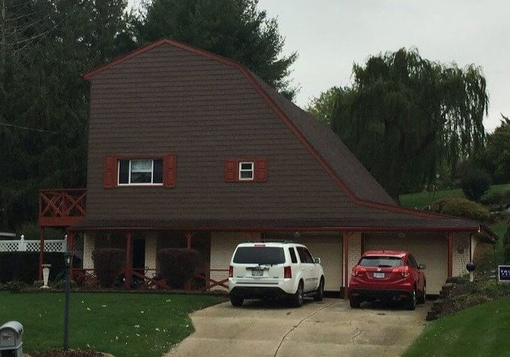
While many are fans of the farm-style aesthetic and design, maybe sawing a barn in half and calling it a home isn't the best way to style a house. The dark wood, lack of windows, and tall, shaded trees also lend this ominous air to the whole feel of the house, but we're certain skaters must love this place. There is also the possibility that this is all a clever security measure: Make a house that doesn't look like it'll be worth stealing from the outside.
Given the lack of emergency exits, the halfpipe of a roof, and the general atmosphere of the place, maybe it's best to skip over a house like this next time you're looking to move.
A Hall of Mirrors Makes for Great Entertainment While Using the Restroom
Sometimes, you stumble across something that worsens the longer you look at it. From the rounded restroom design being one of the strangest choices to the bright pink coloring, this one is certainly a bit more challenging to wrap your head around. To really top it all off, all the mirrors not only give you multiple reflections of yourself but also reflect off of each other, which is nothing short of disorienting.
If someone's ever had too much to drink and needs to get to the toilet fast, this is the last bathroom they'll want to end up in, that's for sure.
The Perfect Bathroom for Multi-Taskers
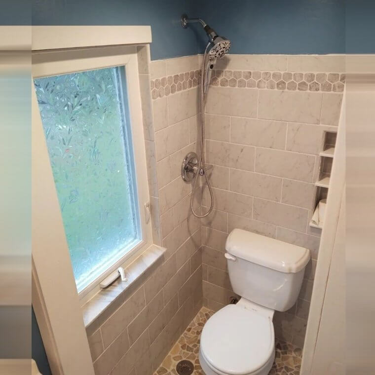
If you've ever wanted to use the toilet and take a shower at the same time, then this is the bathroom for you. And if you think that's weird, then congratulations, you are part of the majority. So, since we've established that no one really wants to use the toilet and shower simultaneously, what is the point of this bizarre setup? Who can explain it to us?
And, on top of it all, there's a huge window right next to the toilet/shower combo! So not only must you wet your toilet and stand around it anytime you want to shower, but you must also expose yourself. Weird!
In Case You're Unsure Where to Push the Door
You know those doors that you always pull even though they're push or always push even though they're pull? Well, this is not one of those doors. The silver plating taking up half of it is a clear and loud reminder that you should, indeed, push on this door. It's also a reminder of where exactly you should push on this door. In fact, the silver plate is so big that it makes us think you should push really hard.
We can't be the only ones who think that, right? If we were exiting this bathroom, you'd probably feel pulled (pun intended) to push this door open with all your might.
The Thinnest Doors Hide The Darkest Secrets
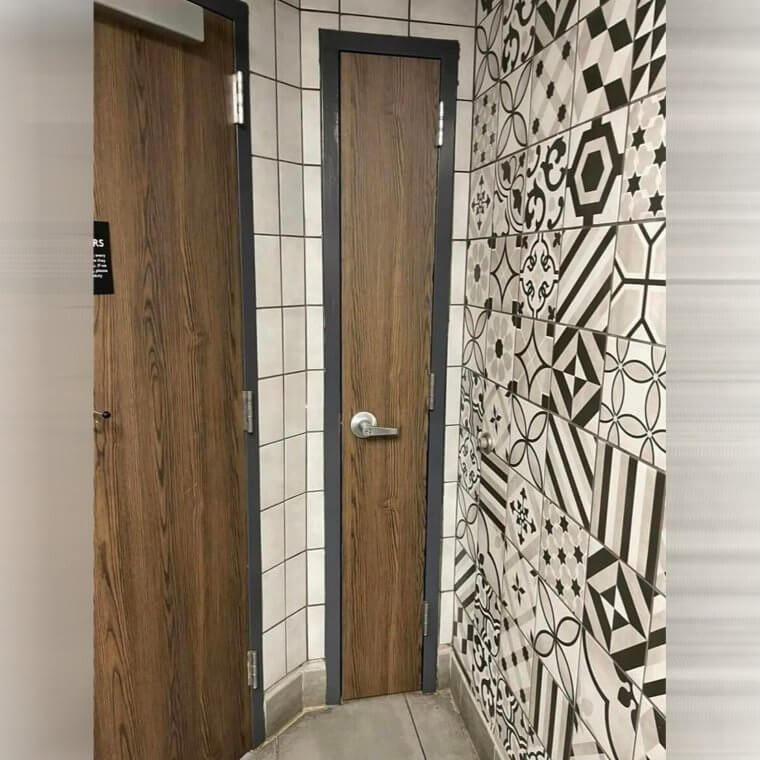
These doors have long since puzzled many, and many have wondered where they could lead and what's behind them. After all, a person can barely ever fit through them. In all likely reality, they're likely storage closets or lead to the water supply or electrical boxes. Still, one has to wonder why they're made so small when they could have just been placed elsewhere or given a bigger area.
While the reality is far less mundane than what our child-like imaginations conceived, there's still hope for a magical doorway leading somewhere dark and mysterious.
At Least Getting to the Toilet in an Emergency Won't Be a Problem
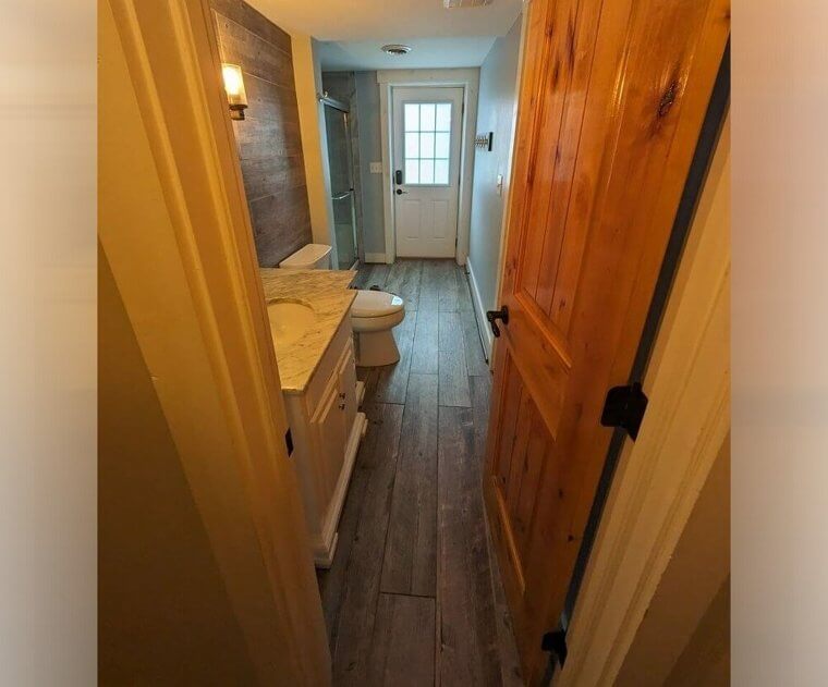
This Airbnb has one of the most uncomfortable designs for visitors. With a bathroom connected to the bedroom, one would think there'd be no problem until you realize that there is another door that leads to the outside. To make matters worse, this door is also their main entrance in and out of the Airbnb. While it's not unheard of to have an exterior door to the bathroom in some places, it being the main door is more than unsettling.
Let's just hope that the bathroom has come in handy more than once and that it all pays off in the end. All we know is that we wouldn't pick this option for our house!
Sometimes, You Just Need That Extra Space
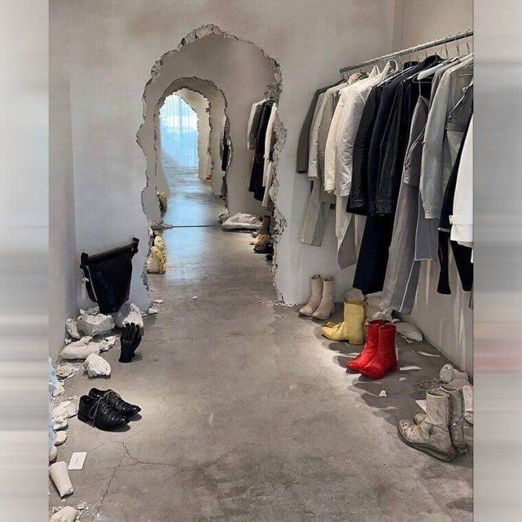
We all have different tastes. Some people enjoy rustic atmospheres, while others enjoy bare-face brick walls and sleek modern designs. Others enjoy it when a doorway looks like a hammer was taken to it multiple times until a person can fit through it. While it's unique, and some might enjoy the aesthetic of a collapsing wall, it's certainly one way to get some extra storage space. As to whether this is the finished project, who can say?
Given the pieces of debris around, this may be an exhibit of some kind, but one thing's for sure: one certainly wouldn't put it past some celebrity to have this in their home.

