Futons Are Way Outdated
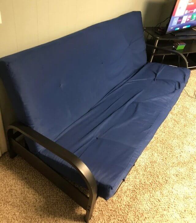
Futons can serve their purpose well. They are great for those who have little space, don't have a ton of money to invest in furniture, and maybe are decorating for the first time. But if you are looking for ways to spruce up your space, ditch the futon. Often they just appear cheap and are not very comfortable. If you want to avoid your room looking tacky, replace the futon with something attractive that is actually comfortable to sit on.
Futons are simply an item that most people outgrow once their twenties and college days are a thing of the past.
Live, Laugh, Love Signs Are Just Cheesy and Cliche
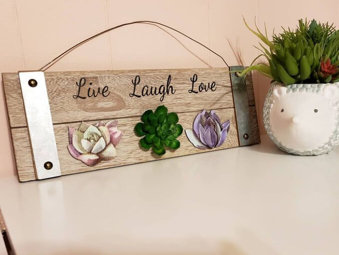
The slogan "live, laugh, love" has been incredibly trendy in recent years, with people printing it on signs and pillows and even getting it tattooed! While the message can be uplifting, as home decor, it can appear tacky and overused. Inspirational catchphrases can quickly cross into territory that comes off as cheesy. Rather than using a basic slogan that's been generated a million times, try more unique and personal artwork to ensure your home is chic and not kitschy.
Low-price-point word art might appeal to the masses because of its accessibility, but if you're looking to truly decorate your home well, skip this decor item altogether.
Plastic Storage Can Potentially Look Cheap
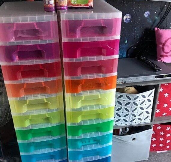
Storage space is one of the most common struggles people encounter daily. It can be incredibly tough to make your house look organized, fashionable and lovely if there is no room for anything anywhere. It's easy to opt for cheap plastic bins and drawers because they're accessible, but if you can spare them, you should. They only make a space look cheap and like a child's classroom, which is not home decor's goal.
But don't fret; no need to throw them away! Just keep these kinds of storage bins in closets or garages where they are kept out of sight.
Untidy Cables Are an Eyesore
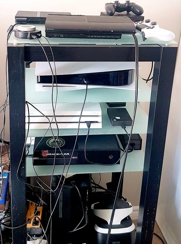
Often times people don't think of cables as decor pieces. Well, they're not, but if they're always in plain sight, then they unintentionally become a part of your home decor, and that's never the right move. They look messy and chaotic, so best to cover them up. You can use cable tidies to wrap them up or hide them under other pieces of furniture; that way, they are always hidden.
This simple tip will instantly make your home appear cleaner, put together, and attractive. So don't wait any longer; cover up those cables!
Shag Rugs Should Stay in the 70s
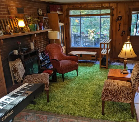
The 1960s and 70s were filled with weird interior decor, including shaggy rugs and carpets. Although they were considered fun and groovy back then, today, they are merely an interior design trend of the past. Shag rugs can potentially make your entire living room look dusty and tasteless, which is not a good look. So if you're looking for ways to upgrade your living room, replace the shag with a more modern rug instead.
If you want your home to look trendy and refined and not like allergen heaven, replace these carpets as soon as possible.
Plastic Couch Covers Ruin the Look of Your Couch
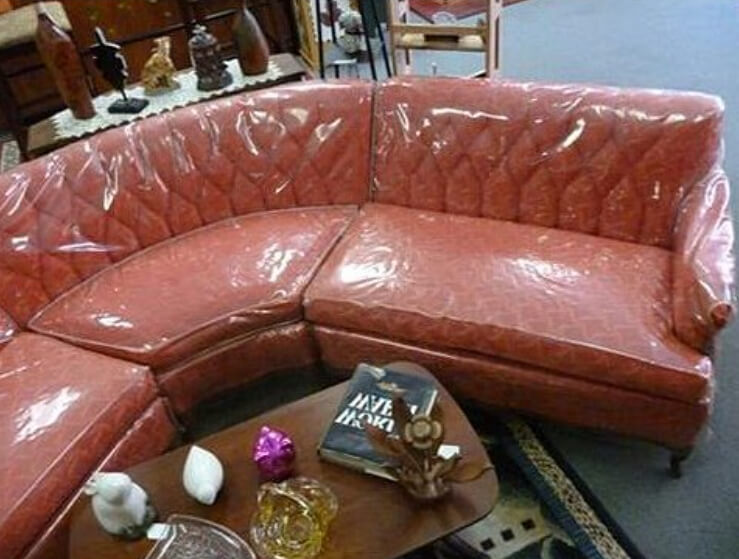
Plastic couch covers may feel like a good idea when you have nice couches you'd like to protect at all costs. But you still pay the price because it instantly makes your home look tacky and your designer sofa looks cheap. It might seem like the right move if you have dogs or little kids around, but it ultimately downgrades your home. The best advice would be to remove the plastic wrap and let your couch breathe.
If your one true goal is to turn your home into an interior design haven, then removing your plastic couch covers is the right move to make.
Ditch the DIY Furniture
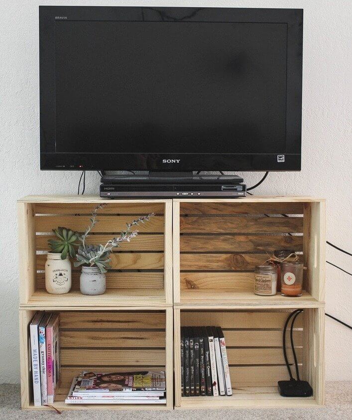
DIY furniture can be a fun hobby and even a way to decorate your house with personal touches that make it feel homey. For instance, taking wooden crates and stacking them as a tv console may seem cool initially. It gives off a rustic vibe, but pallets are not reliable or sturdy. Most importantly, they give off an unfinished appearance that makes your furniture look cheap. Most interior designers would advise purchasing real furniture instead.
DIY furniture using wooden crates is excellent for holiday parties and fun occasions but too cheap for everyday use, invest in a solid piece of furniture is better in the long run.
Kitchenware Racks Could Cause Your Kitchen to Appear Messy
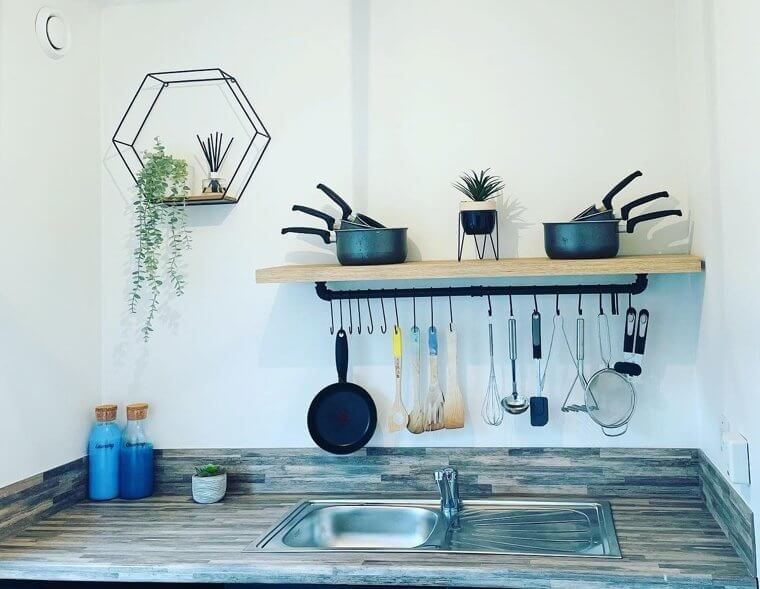
The kitchen can be the most essential room in a house, so when it comes to its design, you must put a lot of thought into it. But if your kitchen is small and lacks adequate storage, people need to get creative. One way is using racks to hang pans, pots, and kitchen utensils. Although it can seem like a great way to optimize space, it just crowds your kitchen and the result is a really cheap, untidy look.
Kitchenware is best kept out of sight. If it's in a cupboard or storage bin, that's great, but hanging, as the main focus of the kitchen, is a design choice best to avoid.
Matching Couches and Curtains Are the Opposite of Trendy
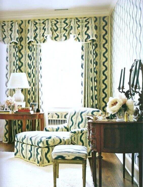
Once upon a time, matching curtains and couches were a hot design fad. However, these days it's become outdated and a trend that should stay in the past. But there's a simple way to fix this! The next time you feel inspired to redecorate, give your curtains an upgrade. Rather than getting a new couch that can be pricey, opt for new curtains that are solid and match your couch's color scheme.
If your living room is too matchy-matchy, it can give off the impression of being overstimulating and tasteless. Luckily, it's an easy fix with just a few minor home decor changes, so don't fret!
Animal Skulls Are Not the Most Enticing Decor Items
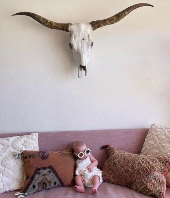
Animal skulls have long been a favorite home decor item to hang on a wall, but could there be a time when they've become outdated? The answer is yes, and the time is now. Whether they're a trophy from a hunting adventure or a souvenir from a trip to the Southwest of America, it's not a great look. They tend to make a space intimidating and look out of place and strange.
The best advice from several interior designers is to skip out on decorating with this item altogether. Instead, try hanging framed posters or artwork.
French Country Style Is Out of Style
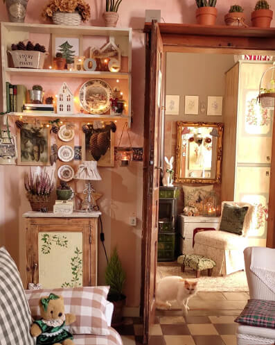
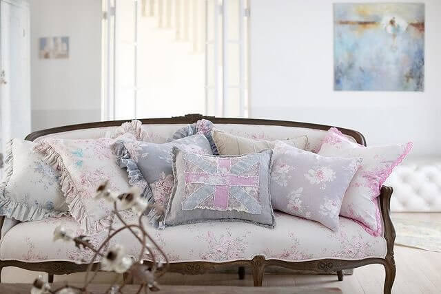
A style called French country has been an incredibly common home design trend throughout the years. It is supposed to be a mix of rustic, antique, and soft decor items. While this popular style can appear very feminine and pretty, it is too old-fashioned for the current design trends. It can make your home look very cheap or junky, which is not the best look for those looking to modernize their space.
For those living in the countryside of France, French country-inspired home decor items make sense. But if not, this traditional interior design style is simply too tacky for homes today.
Faux Plants Do Not Look Like Real Plants
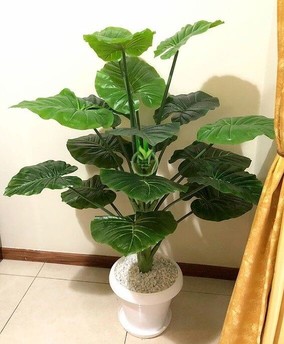
When it comes to decorating your home with plants, it can get tricky. Natural plants require proper care and attention to keep them alive and looking fresh and beautiful. Although it takes extra effort and maintenance, the alternative is filling your house with fake plants. But most interior designers will tell you that this is the wrong move. It's hard to find fake plants that appear real and, more often than not, make your home look cheap.
If you're up for the fun challenge, decorating with natural plants is worth it. Who knows, maybe you'll discover you had a green thumb all along.
Bold Statement Walls Can Be Overwhelming
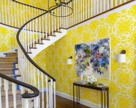
If your style is bold, fun, and colorful, it can be tempting to fill your walls with something to represent your personality. But sometimes, design choices are taken a tad too far. There is a way to make your home feel like a fun representation of yourself but not overdo it and ruin the aesthetic. Neon colors and busy wallpaper patterns will simply overwhelm the space and dominate it in a gimmicky way.
If you are a fan of everything bold, keep your walls simple and choose bold decor items instead. This way, your space is more versatile and easier to redecorate throughout the years as your style evolves.
All White Everything Can Really Look Stale
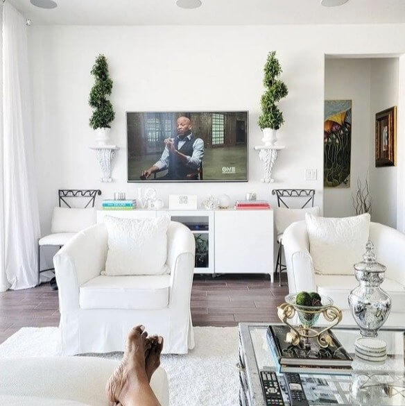
White walls are classic, and a white rug or couch is definitely a risky but classy move. But when does it become too much? If your space is entirely white, it can appear sterile and relatively low-budget. It's best to have your house feel comfortable and inviting, so all-white everything can quickly contradict this. You don't want your home to look empty so fill it with pops of color to appear more trendy and high-class.
So if you want people to know you have good taste, fill your space with only one or two white items, like a coffee table and tv console. Then let the rest of your decor and furniture be accent colors to bring richness to the room.
Mason Jars Should Be for Crafts Not Decor
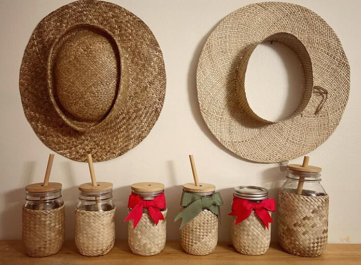
A great way to help the environment and get crafty is by repurposing items. While mason jars are the perfect items to do this, there is a time and place to display them. For holidays, parties, and specific events, decorating with mason jars can be creative and fun. However, having them out year-round as your main decor is not the most fashionable choice. It can potentially make your home just look tacky and cheap.
Mason jars are great to store various items in, but they can quickly make your house look unrefined, so avoid doing this to ensure your home looks tasteful!
Famous Artwork Reproductions Are Cheesy
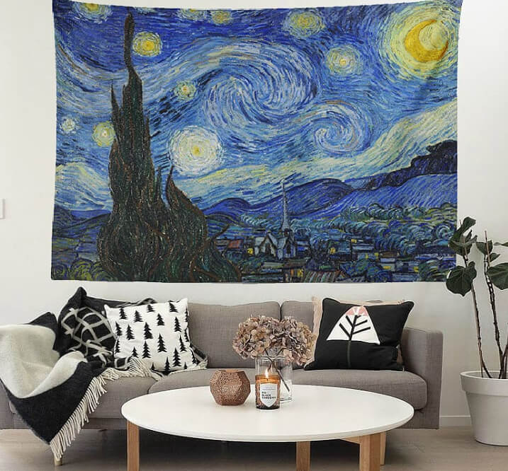
Famous artwork by talented artists like Monet, Van Gogh, and Picasso is recognized worldwide. There are millions of recreations and copies of their work, and it's pretty common to find replicas printed on everything from pillows tapestries and poster paper. At first, it might seem like a good idea to give in to this trend and decorate your home with items printed with their famous artwork, but it's actually quite kitschy and can give off a discount look.
Why would this be a wrong design choice? Well, so many people have these replicas of famous art that it just becomes too ordinary. Not to mention if it's not the original, it means it's a discount copy.
One of a Kind Lamps Are Not the Best Look
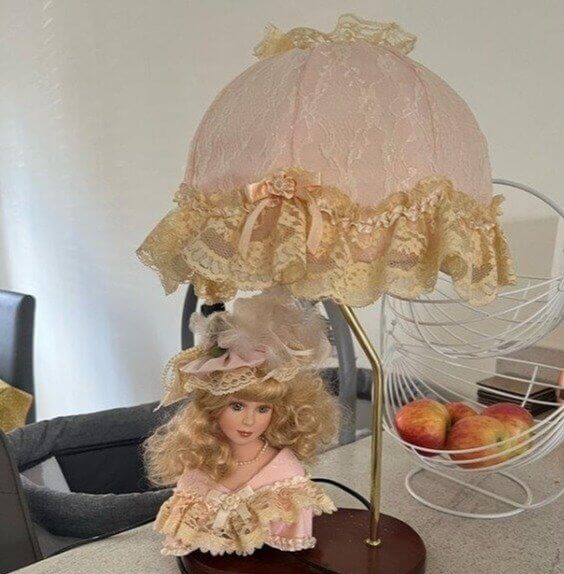
Most people don't realize just how crucial lighting is and how it can drastically impact your house's look and feel. However, on that note, sometimes people take it too far and focus on the wrong things that have to do with lighting. Specifically, buying bizarre lamps that can potentially make the entire look of your home look less valuable. It's better to invest in lovely lights so your living room is beautiful rather than tacky.
So skip the lamp that looks like a doll's head or a leg, and choose a simple one, including the right bulb color, and you are all set.
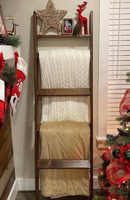
Blanket Ladders Are Not Really Practical
This is another interior design flop that is all too common, but it's time for people to be aware of it. Blanket ladders are a decor item of the past! They may seem practical to keep in your living room, so if you're chilly on the couch, it's easily accessible to grab a blanket. But unfortunately, they can make your space look out of style and quite gimmicky. If you want your home to look more expensive, simply remove these items!
If you must have blankets out, then a better option is to buy them in a color that compliments your furniture, fold them nicely and leave them on the couch.
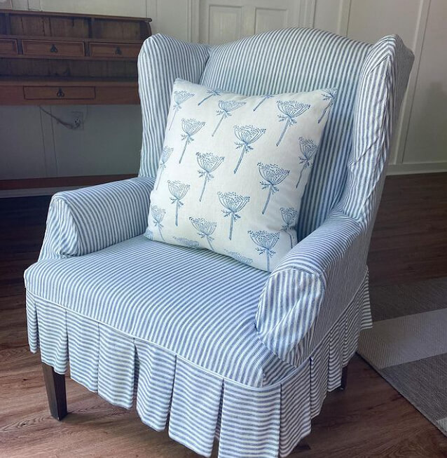
Ruffled Furniture Skirts Are Just a Bad Look
Ruffled furniture skirts are a trend that you must avoid at all costs. Many people have these left over from decades ago, but if there is any time to upgrade your house and redecorate, it's now. They can make your home feel old-fashioned and out of touch with current trends. It's something you'd probably find in your grandmother's house, and even if you are a grandma, there's no need to keep this vintage trend around.
Furniture skirts are way too proper for a living room or kitchen, so kick this trend to the curb, and you'll be on your way to interior design success.
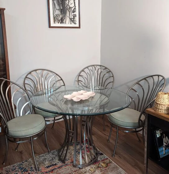
Stay Clear of Glass Furniture
From the 1970s to the 1990s, glass furniture was especially popular, and you couldn't walk into a house without seeing at least one piece of furniture made out of it. But today, glass tables and cabinets are very outdated. Suppose you're currently looking to redecorate and replace any big pieces of furniture; better not to buy anything made out of glass from now on. It can be pretty high maintenance and get dirty quickly.
Glass is notorious for smudging, so unless you are constantly cleaning it, your home may look dirty, and that's never a good look.
Small Rugs Can Make Your Space Look Awkward
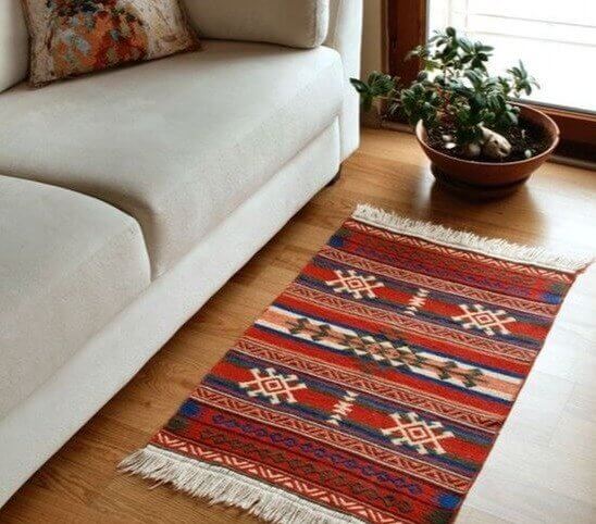
Rugs are usually the best trick to enhance any room and make it look like an interior designer's dream. However, picking a rug is tricky. If you choose a great rug that's perfectly sized for the room, then it can elevate your space. But if you have a rug that's too small for the area, it just looks awkward and out of place. Yet many people commonly make this simple mistake.
If you have a rug in your living room, your entire couch should fit on it, and you should still be able to see the rug. This way, you know it is not too small.
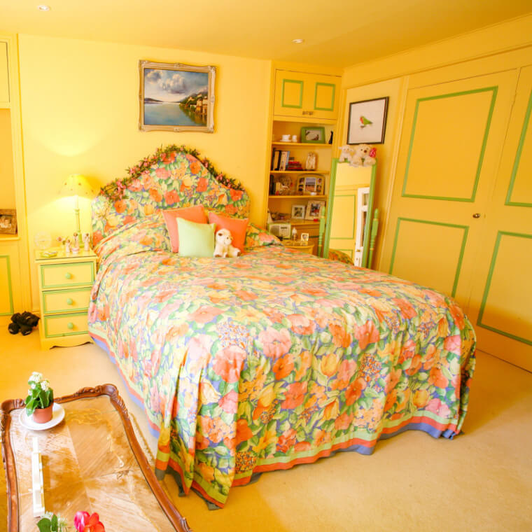
Chintz Wallpaper Is Too Old-Fashioned
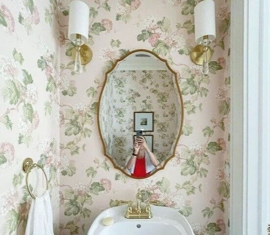
Chintz wallpaper can be gorgeous, especially in Victorian museums or cool hotels. How about in your home? Interior designers would say skip out on this trend when it comes to your own home! It can really age your space and become overbearing after a while. It will be hard to add anything else to the room without it clashing or becoming crowded with too many different colors or items.
This wallpaper is dated and can appear like you haven't decorated or remodeled your house in years. So a classic white wall is always great if you're looking for something more modern.
Shot Glasses as Decor Make Your Home Look Like a Dorm
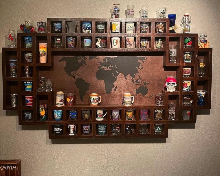
Many people have collections as a fun way to collect souvenirs or memorabilia and keep a certain nostalgia around. But there are some types of collections that, when on display, just appear tacky. One of them being a shot glass collection. Maybe you would see this in an apartment belonging to a few college students, but as an adult, it's not too trendy. Rather than have them on display as decor, keep them tucked away.
There is nothing wrong with collecting shot glasses, and it's incredibly cool if each glass represents a country you've visited. However, as decor, it's not the best idea.
Pallet Furniture Looks Unfinished
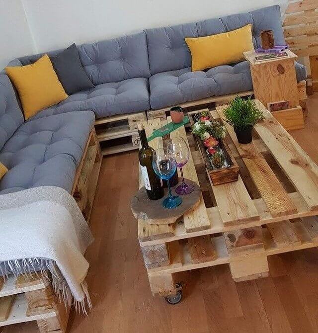
Wooden boards and pallets are great for arts and crafts. Many people like to build coffee tables or side tables with these pallets, and while that can be fun, it's not the most aesthetically pleasing furniture. It appears unfinished and cheap. If you prefer wood, it's better to opt for a solid wooden table. It will look better and be sturdier. Better keep the wooden pallets for DIY projects and not everyday furniture use.
Next time you are shopping for furniture, keep this tip in mind. This way, you'll avoid a tacky and cheap-looking room.
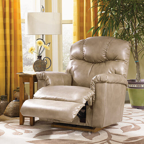
Time To Rethink That Overstuffed Recliner
We've all seen the parodies of these kinds of chairs on TV and in movies, where plush recliners have cup holders, built-in refrigerators, or even a fully functioning toilet in the seat. The fact is these chairs have been bulky and overly complicated from the beginning, featuring a large wood or plastic lever on the side that needs to be yanked with the strength of ten men in order to lean back and extend the footrest.
Although it may be our dad's favorite chair to fall asleep in, these are certainly not adding any style points to the living room. Replace it with a nice comfy chair without all the machinery for an upgrade.
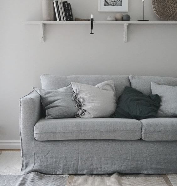
Matching Couch Cushions Are Boring
Couches are bulky; more often than not, people opt for a neutral-colored couch to match everything they decorate with. So when it comes to pillows for your sofa, don't get pillows that are the same or a similar color to the couch itself. It will only look dull and monotonous. The point of pillows is to give a room pops of color and compliment the furniture, not wash it out.
So make sure you decorate with pillows that are complimentary to the rest of your space, and you will have a lovely and trendy living room.
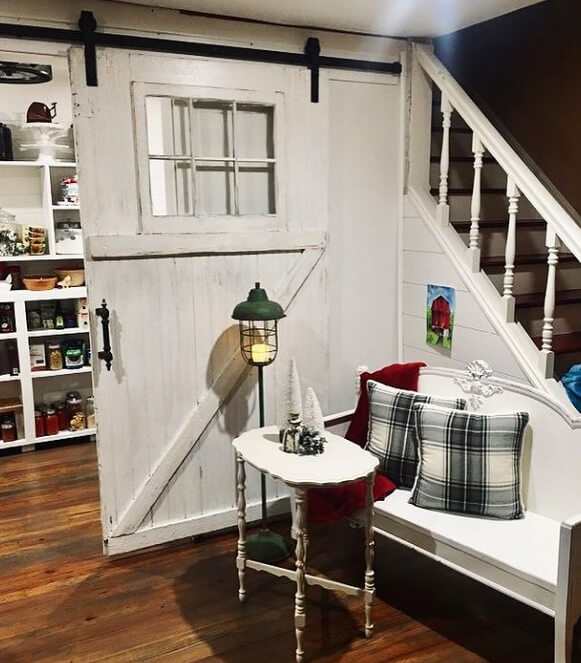
Barn Doors Belong on Farms Rather Than Inside a Home
A trend that many homeowners have been partaking in is using a barn door as a decorative door in their house. It's usually placed in the entryway or as a divider between rooms. But it's just a bizarre trend that should be stopped. While it may feel rustic and unique, it really is just bulky and jarring. It is hard to keep up with changing trends, so a regular door will ensure you don't suddenly have an out-of-style door.
A farmhouse aesthetic for your home can quickly become unstylish, so installing a barn door might just end up being more inconvenient than cool.
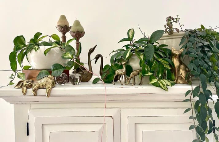
Don't Crowd Your Space With Too Many Trinkets
Usually, someone's home is filled with dozens of trinkets because they are valuable to the person. Maybe they are antiques they've collected or memorabilia from their family. But, there is a thing as too much decor. If there is no space at all left on your shelf or table, it's probably a good sign you need to remove some of your items. Decor should enhance your room, not overwhelm it.
A few trinkets on display can add a nice touch to a room. It shows some of your personality and brings some life to the space.
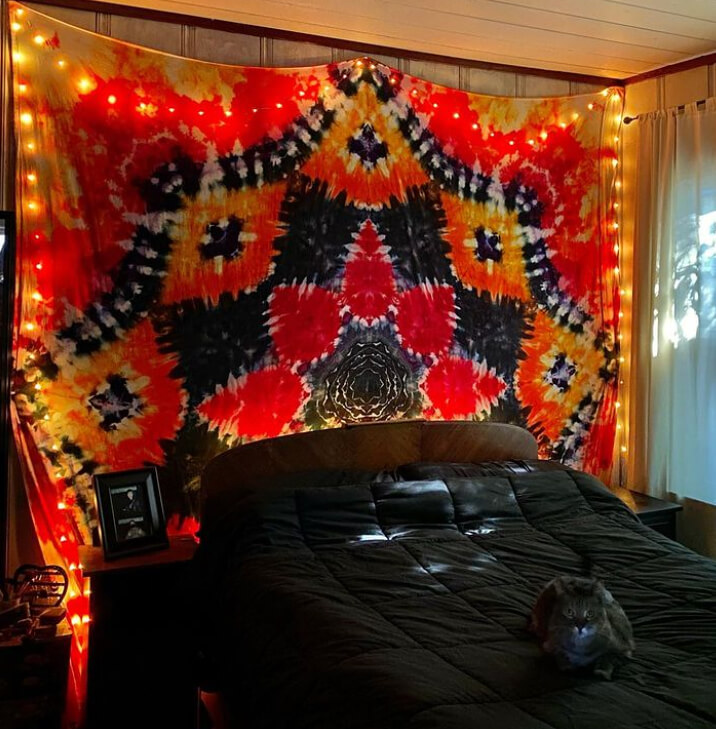
Tapestries Are for College Kids
While tapestries can add a fun flare to any room and liven up the walls, it's easy to overdo it. They are usually covered in multiple colors and very busy patterns, which can be hard to match to other decor items. While nothing is wrong with this, it's not the most sophisticated look for an adult with their own home. These are great for college students, but as you age, buying actual wall art is a great investment.
Instead of hanging tapestries on your wall, you can try floating shelves, plants, mirrors, or framed artwork. This will create a much more mature look.
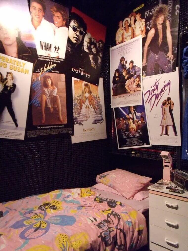
Frame Your Posters if You're Past Highschool
As a teenager, it was incredibly cool if your walls were covered entirely in taped-up posters. But as an adult, it can look a bit childish or cheap. However, there is still a way to decorate with posters of movies and bands but make it look trendy and sophisticated. This simple trick is to frame your posters with a solid white, gold, or black frame and properly hang them on your wall.
This way, you can still channel your inner love for music and cinema and hang all your favorite stars on the wall. Only it will look iconic and cool rather than tacky.
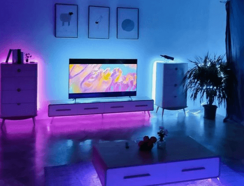
Color-Changing Lights Can Appear Juvenile
It can be tempting to purchase lights that change to all sorts of colors as a way to upgrade your space. But this doesn't add elegance to your house; it appears pretty tacky. If you're looking for mood lighting, it's best to purchase a lamp where you can adjust the brightness or light some candles. LED colorful lights that resemble a nightclub are not a cozy and inviting environment to turn your home into.
Using colorful lights in your home is not an excellent long-term design choice. So if you want to ensure your home decor is up to date, avoid this.
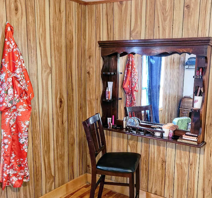
Wood Paneling Can Really Look Dated
A typical design choice is to have wood paneling as your walls. However, this is supposed to be a rustic look, but it can quickly make your home look uninviting. It resembles a cabin rather than an incredible artistic design. It's too easy to get carried away with wanting your house to be different and stylish, but sometimes these trends are taken a tad too far. This is another example of when you should leave your walls alone.
Adding wood panels to your house's walls is a waste of money. It's better to leave your walls as is and invest your money into other worthy home decor items.
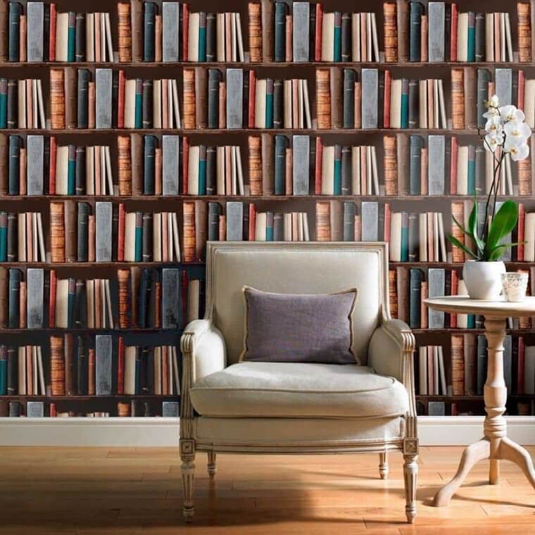
Skip the Bookcase Wallpaper and Buy Real Books
One of the most incredible things someone can have in their houses is a library or, at the very least, bookshelves filled with fascinating reads. However, it can be expensive to acquire this, and not everyone has the space. So some people started opting for wallpaper that looks like a bookshelf. However, this is just cheap-looking and unsatisfying. Avoid any patterned wallpaper that is an illusion; it's for a fun house, not your home.
It's much better to install actual shelves and fill them with real books rather than fake them with tacky wallpaper. Your home will be way more inviting this way.
Too Many Patterns Can Be Overwhelming
If your home decor style is maximalism, then you are probably the type of person who fills your house with dozens of patterns, colors, and decor items. From wall hangings to rugs to pillows and furniture, your style will probably be all over the place. But remember, this can overpower your home, appearing chaotic and gaudy. However, this doesn't mean you need to lose all colors and patterns completely but choose carefully.
Using a few complementary colors and one or two patterns that tie well together is always fun. Any more than that, and you're crossing the line from stylish to tasteless.
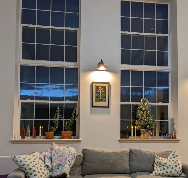
Windows Without Drapes Are for Exhibitionists
It's vital to many people that their rooms get plenty of natural lighting. However, is there ever too much? Well, there can be. If you refuse to put any curtains or drapes on your windows, then it can become a problem. Sometimes you don't want all the sunlight brightening up your room because it causes a glare if you watch something on a TV. Not to mention, there is no privacy at all.
Anyone can peer into your home through the windows at any time, and that's not a smart move. So invest in some beautiful curtains, and you're set.
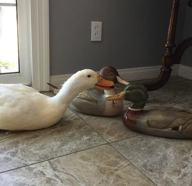
Wooden Mallards Are Simply Out of Style
What do people usually collect? Coins, shot glasses, maybe even postcards. But did you know it's pretty common for people to have a collection of wooden mallards, and no less, on display? However, if you have these around your home, it instantly dates it. These little ducks are simply out of style and don't contribute anything positive to your home. They are old-fashioned and used excessively. So an easy way to upgrade your space is to replace them.
Now that you know these are not very trendy, you can shop for new home decor items that give off the impression you are an interior design genius.
Too Many Cushions Are Impractical and Silly
What decor items are usually placed on a couch? It's either blankets or pillows, or both! However, there is one mistake people make far too frequently. Crowding your couch with too many pillows. Sometimes people think that the more you add, the more fashionable your living room will look. However, it's actually the opposite. Depending on the size of your couch, two to three pillows are plenty and no more than that.
It's impractical to have your couch completely covered in cushions and pillows unless you never want people to sit on it.
Big Mouth Billy Bass Is Not Cute Anymore
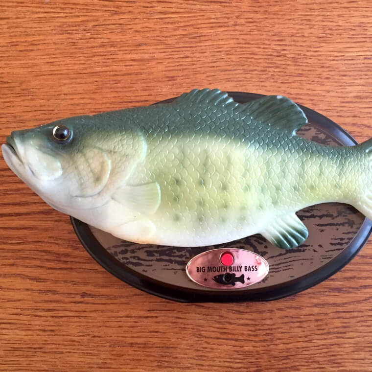
Big Mouth Billy Bass is quite a weird creation. One of the most memorable and iconic creations to come out of the 1990s is this singing fish wall plaque. It was once common in everyone's home, and if you didn't have one, you wanted to get your hands on it, mainly because your kids bugged for it. However, today it's not very popular and actually downgrades your home. It's best to take this off your walls and sell it.
It's not a very lovely decoration to look at, and there are plenty of much nicer things you can put on your wall rather than this.
All Gold Seems Classy but It Can Likely Look Brash
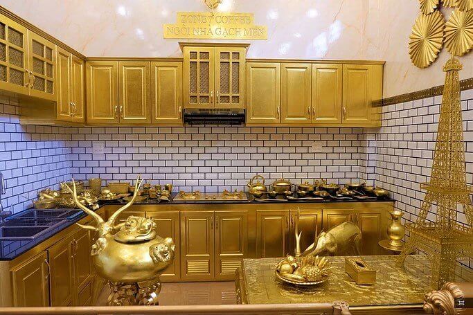
This outdated interior design trend needs to go away and never come back. During the 1980s, it was pretty common to have brass and gold fixtures in your house. But all gold, everything is just tacky. It might seem like a bold and flashy design choice, but it just looks weird. Although adding gold accents is a good move, it shouldn't be overbearing. You better stick to small gold decor items instead.
Your home is not supposed to look like a museum! So stay clear from the glitz and glam, and don't cover your house entirely in gold or any color for that matter.
Fluorescent Lighting Is Not Made for a Cozy Home
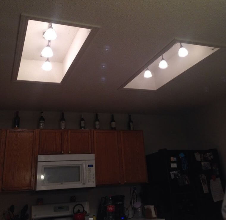
Do you know where fluorescent lighting is commonly used? In hotels, health care facilities, grocery stores, and parking garages. But some people have this lighting in their homes, which is a huge mistake. It doesn't create a warm and comforting atmosphere like your home should feel. This type of lighting is meant for commercial places and is pretty bleak. If you have fluorescent lighting, the best move is to replace it.
Fluorescent lighting is harsh and intense, which is not the vibe you want in your home. A house should have soft white lights to create a nice homey feeling.
Plastic Dishes Make Your Kitchen Look Unsophisticated
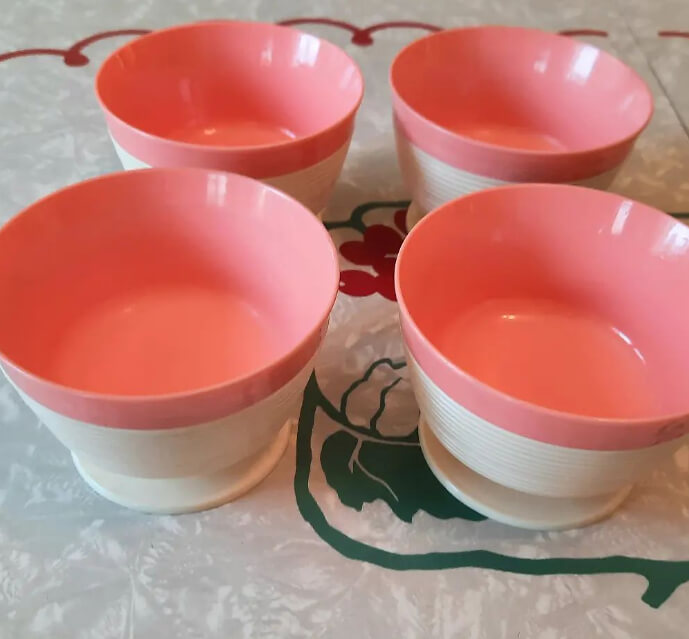
Plastic dishware and cutlery can be very convenient when you have a party or areas serving food to toddlers. But other than that, there is no reason to use plastic dishes solely. It makes total sense in those situations, but for everyday use, it is just cheap. Instead, buy a nice set of glass or ceramic dishware. It will last for years and is a good investment for your home.
It can be sort of childish and unsophisticated to eat with only plastic utensils and dishware. So unless you absolutely need to, avoid it at all costs.

