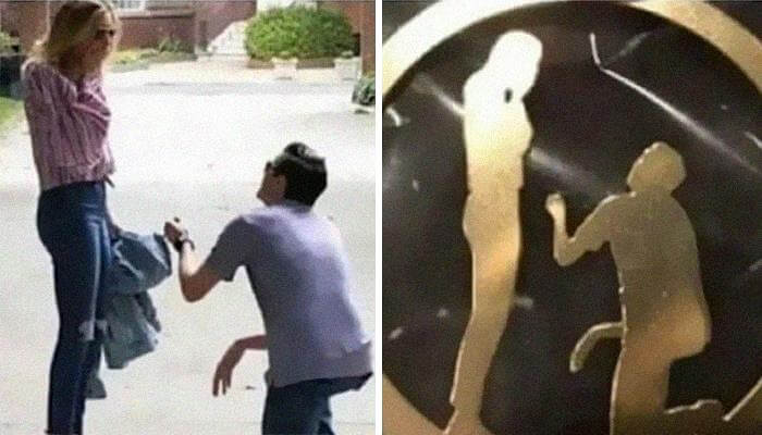
This Commemorative Gift Design Didn't Turn Out Quite As Planned
It's the thought that counts, right? Well, we're sure that's what this boyfriend thought when he got this badge back from the maker. He had it commissioned as a gift to commemorate the two's engagement. However, it's just a bit... off. But to be fair, this isn't entirely on him. Whoever made the badge didn't even do a good job of recreating the boyfriend's right hand on the badge.
You can't make out any fingers or anything else that might clue someone into that actually being a hand. In addition, there is no wrist; everything just appears as if it's hanging.
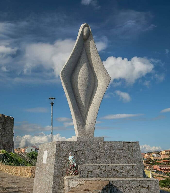
The Virgin Mary Welcomes All
We've seen a lot of statues of the Virgin Mary, but we've never seen one quite like this. The sculptor was probably going for something a bit more unique when they designed this statue, and they certainly achieved their objective. If you didn't know what this was before seeing it, you'd probably think it was a dedication to something entirely different. Still, it does have a certain charm to it.
And honestly, it sort of resembles some of the older depictions and statues of the Virgin Mary, which usually focused more on fertility and the... virgin part of the name.
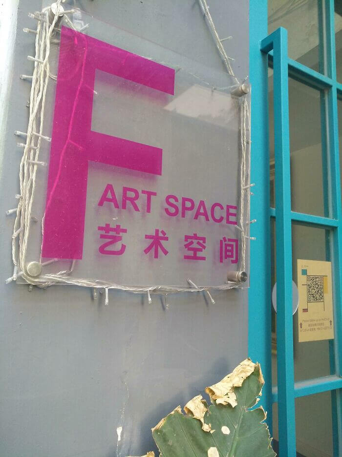
"Art" Space With A Capital "F"
Someone didn't think this sign all the way through when they decided to throw a giant "F" right in front of the word "art." It ended up spelling "Fart space," which we're sure isn't what this room is meant to be used for. However, that begs the question of why there's a letter "F" there in the first place. It could just be the building designation maybe, but then why not just put that on a separate sign?
Either way, we're sure the sign maker probably got a good laugh when they were given the task of making this sign. It's actually kind of surprising they didn't bring this up so it could be fixed.
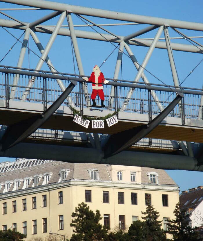
Don't Do It Santa, It's Not Worth It!
Like many of the design fails on this list, this one came from good intentions. This city just wanted to try and bring some joy to people by hanging Christmas decorations around town. However, they probably placed this Santa in the worst possible spot. It looks like Santa had a fight with Mrs. Clause and said to hell with everything. We hope someone called the fire department to talk him down from there.
It probably wouldn't be quite as bad if it weren't for the ironic text underneath, which reads, "jump for joy." This is another one that you would think the people installing the sign would've caught.
When You Cheap Out On Hiring Another Actor
A lot of times, we take for granted the extra effort advertisements make in hiring multiple unpaid or poorly paid actors for their advertisements. However, this is what happens when a company refuses to do even the bare minimum of hiring male and female actors. They just took the first guy's face and photoshopped some woman's hair onto it, almost like they thought nobody would be able to spot the difference.
The worst part might just be that this looks like a pamphlet for a casino, so you know they had a couple of extra bucks they could've used to just hire a woman.
Just How Nature Intended
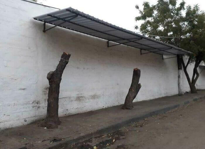
We hope this isn't the case, but it appears as if the town or city this photo was taken in cut these trees to make room for a place to install panels for shade. Honestly, we can't imagine any city planner actually chopping off the tops of trees in order to build something as hideous as these panels, but you never know. The entire thing looks like it was built right after the trees were cut.
That said, it's also entirely possible that these trees were messing up the foundation of the building or that they were already dead or dying from some kind of disease.
Always Ready To Rock
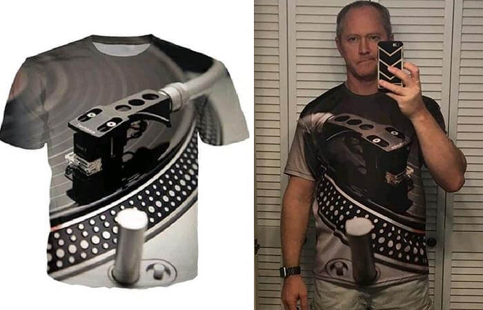
This is probably one of the worst shirt designs we've ever seen, and there are plenty of bad shirt designs out there. The shirt has an image of a record player on it, and for some reason, the designers thought it'd be cool to add a long rod in the middle of the shirt. We realize record players have these, as well, but why add one that pops out like that?
That said, the mistake of actually ordering one is entirely on the guy in the second photo. It looks exactly the same there as it does in the product picture.
The Definition Of False Advertising
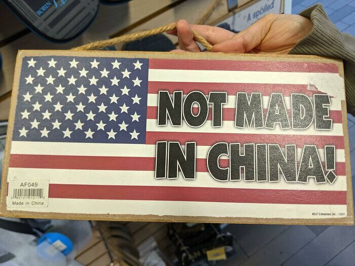
There are plenty of products out there claiming to be "made in the U.S.A.," and to their credit, a lot of them are. However, sometimes you come across something like this. This American flag sign has giant letters plastered all over the center of the flag, stating, "Not Made In China." But that's not what the bar code in the bottom left corner says. In fact, it says the exact opposite.
On top of all of that, there should also be one more red stripe at the very bottom. We're sure the workers in China who made this probably had a really good laugh.
Who Knew Dogs Were So Scary When They Smiled?
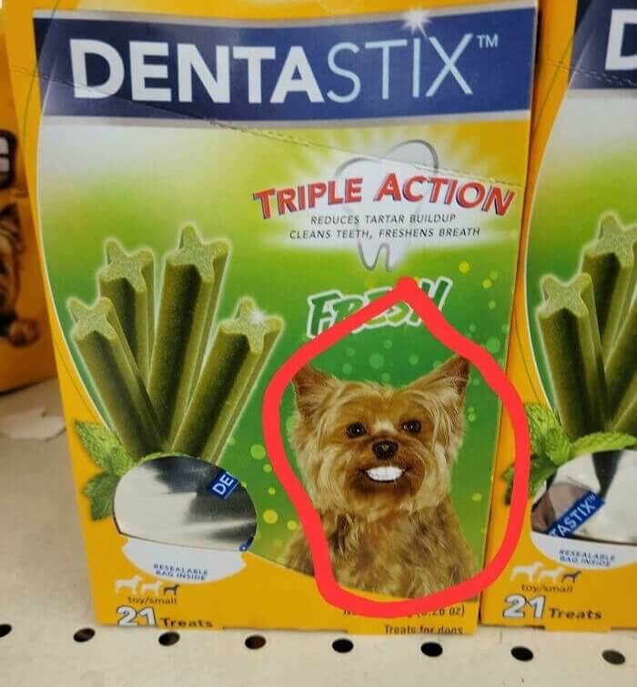
If you're not familiar with Dentastix, it's a treat that's meant to be chewed on by dogs that helps them clean their teeth. The idea is that the corners of the sticks will brush away plaque. However, the photo of the dog on their packaging would have you believe that your dog's teeth are going to completely morph into human teeth after chewing on a couple of sticks at home.
It's honestly a bit unnerving seeing a dog with a smile like a human's. We love our pooches, but they do have really goofy grins. Maybe Dentastix was just doing this for comedic effect, though.
A Helmet That Resembles A Human Head
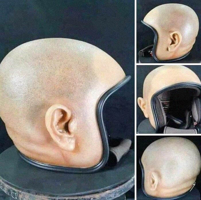
We're not entirely sure if this one is a fail or not, but someone apparently designed and produced a motorcycle helmet that looks like a human's head. We suppose that as long as it actually works, then it's maybe not a fail. However, it definitely gives us the creeps, and we're sure you're going to get pulled over for not wearing a helmet if you try to sport this thing out on the highway.
You might also lose a couple of pieces if you ever banged your head on the cement. The last thing you want is for EMTs to try and decipher which ear is real and which is not in a dicey situation.
Only Kind Of Frozen
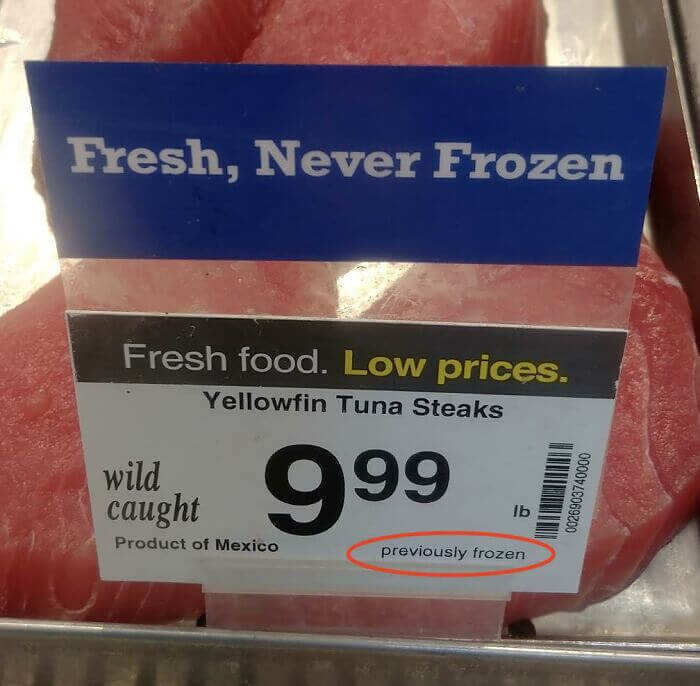
We're sure most people out there are used to seeing signs that say "fresh, never frozen," but just how true is that? Well, it's probably not very true at all. Firstly, most people would probably prefer it if a lot of different types of meats were frozen at some point, or you run the risk of contracting an illness. And the same applies to fish, especially if you have to transport it over long distances.
Still, to have a sign claiming that this fish wasn't frozen, and then fine print that says it was is just dishonest at worst and a weird decision at best.
These Are Nice, But Let Us Show You Our Values
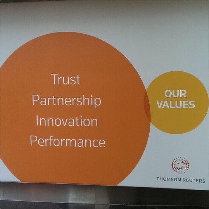
This one is pretty hilarious, mainly for the fact that it's coming from Thompson Reuters, one of the largest and most trusted news services in the world. Someone was probably doing a presentation somewhere and screwed up the PowerPoint. You can see the list of values in the bubble on the left, but they don't seem to overlap with the company's values on the right. It wouldn't be so bad if the circles didn't overlap and look like a Venn diagram.
Reuters usually has pretty good graphics, too, which leads us to believe that the graphic designer was out that day or something and someone had to make this without expert help.
So Hot It's About To Blow
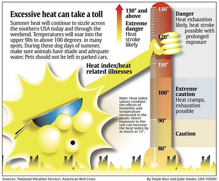
Everyone has a bad day. This graphic designer was probably churning out artwork for different pages and didn't have time to fully go over this image for the weather page. At least, we hope that was the case because how could you otherwise miss something like this? We get what they were trying to go for, but the thermometer looks like something entirely different with the sun's hand on it like that.
Like much of the other design fails here, someone at USA Today should've caught this before it went out. That responsibility usually falls to an art director or an editor.
It's A Tough Market Out There
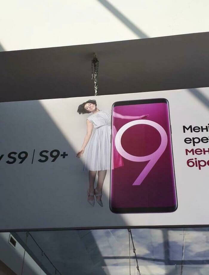
Competition among phone manufacturers is really cutthroat. If you don't believe us, then just take a look at this photo. Jokes aside, whoever designed this probably never would've imagined that it would end up looking like this when the sign was hung (no pun intended). However, it probably didn't take people on the street very long to look up and tell that something looked a little off about this advertisement.
It all just lines up a little too perfectly. The happy look on the woman's face doesn't really help either, which is weird because you'd think that it would.
These Dog Bone Paperclips Are Working Double Duty
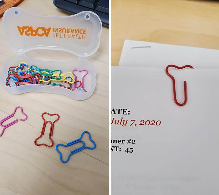
This might not even be a design failure. The dog bone paperclips in this photo double as both a dog bone and another kind of bone. So much so that it's kind of hard for us to believe that this wasn't intentional. You could also just clip them with the middle portion behind the paper (as most paper clips are meant to work), and it'd still look like a dog bone.
Apparently, it didn't people very long to notice these resemble certain bodily parts because a simple search for one now yields a couple of different gag gifts all based on this design.
One Size Does Not Fit All
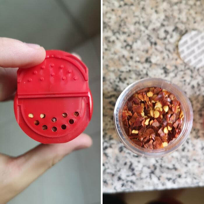
This would be absolutely infuriating. This person opened the cap on a container for chili flakes, only to find that the holes in the cap weren't big enough for the actual chili flakes to fit through. Sure, they could drill their own holes or just unscrew the entire lid and sprinkle that way, but it just seems like the company would've caught this before it was sold. The entire line probably shares the same type of caps.
Interestingly enough, sometimes you'll find bay leaves in containers with caps like this. Like, entire bay leaves, which are meant to be used whole or at least in halves.
Despite Inflation, The Price Of Kids Is Still Falling
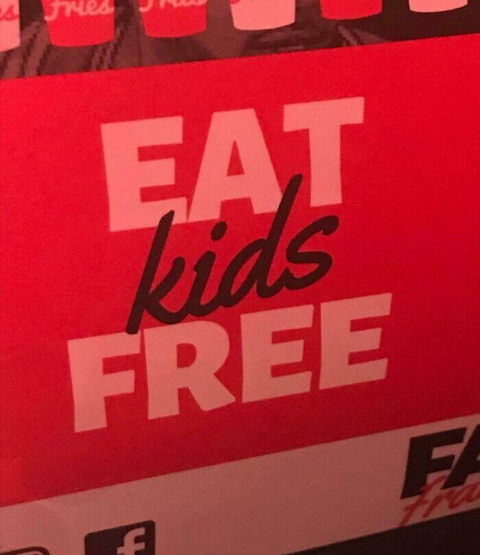
We're not sure where this sign was spotted, but we wish we knew. It reads "eat kids free" when it should read "kids eat free." For some reason, the designer decided to stick kids in the middle of the phrase, and despite trying to offset it with a different color, it still looks awkward. However, it's good to know that at least one thing is decreasing in price when everything else seems to be rising.
Baby back ribs used to be so expensive, though, which makes us wonder if this place is even making a profit with deals like this one. (Okay, we'll stop now).
Looks Pretty Appetizing
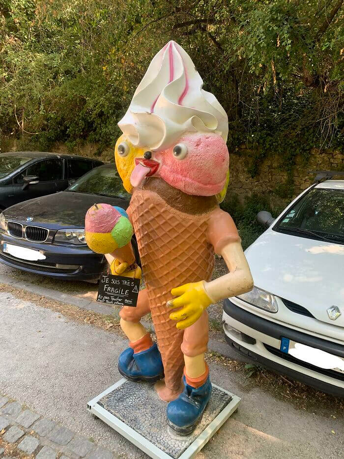
In case you weren't sure (don't worry, we weren't at first either), this is supposed to be ice cream. Or, at least, some kind of ice cream man thing. Instead, it just looks like something someone who's never seen ice cream in their life threw together after a few quick Google searches. It's actually pretty horrifying, but we also kind of love it. Is there a word for that?
In addition, there seems to be something leaking out of the bottom of it, which would imply it's going to melt away soon. And now we kind of feel bad for it.
They Knew What They Were Doing With "Tit's Pizza"
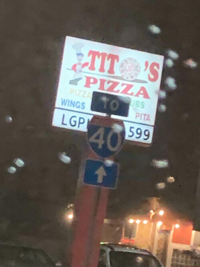
Whoever made or designed this sign entirely knew what they were doing, and you can't convince us they didn't. For whatever reason, using a pizza as an "O" just isn't working here, and our brains aren't falling for it. Someone managed to snap this photo when they were passing by in a car before posting it, which is why there's a road sign taking up the bottom portion of the advertisement.
They also said that they blurted out "Tit's Pizza," and their mom wasn't very appreciative. We can't really blame them because for some reason the sign just makes you want to say it out loud.
A Set Of Trick Stairs
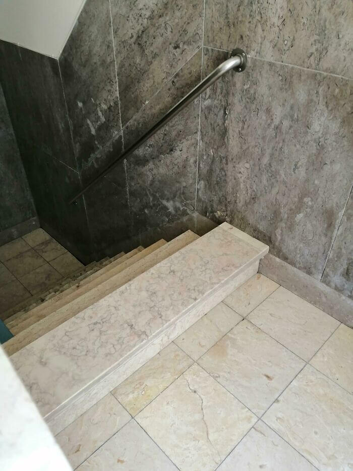
As if climbing up and down stairs wasn't already tricky or scary enough. Enter this set of stairs, which is who knows where. For some reason, the designer thought it'd be a good idea to add an elevated step right before you step on or off. We're not really sure what the design philosophy or point is behind this, but it could possibly be some kind of anti-flooding measure maybe?
Still, we're sure that countless people have tripped over these and nearly busted their faces, so there's a risk/reward factor to take into account with things like this.
How Not To Break The News
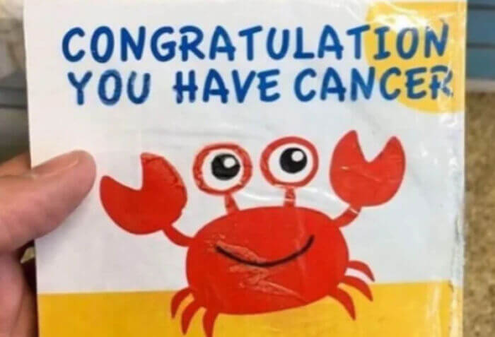
This one might seem bad, but it's actually not as bad as it looks. The card says, "Congratulation, you have cancer." However, it's referring to the zodiac sign and not the medical condition. The zodiac sign for Cancer is actually a crab, so this all tracks. Still, there was probably a better way to phrase or show that information. The designer could've added a couple of stars or other signs in there to differentiate the two cancers a bit better.
As it stands, it just leaves you wondering why someone gave you a card, with a really happy crab on it, congratulating you on having cancer, which is kind of dark.
To Infinity And Beyond
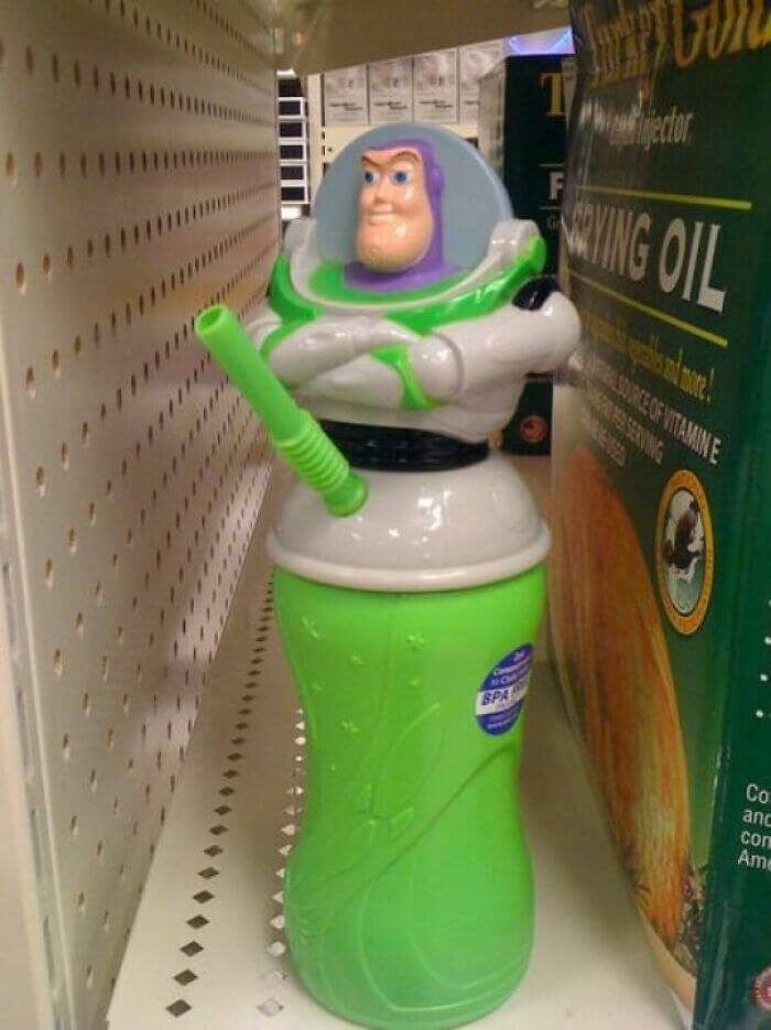
As far as kid's toys go, there are some pretty questionable designs out there. This Buzz Lightyear cup might just be one of the most inappropriate we've seen, though. And it's all because of one design choice. For some reason, someone thought it'd be a good idea to put the straw in the area Buzz's pelvis would be. Maybe they wanted people to feel really uncomfortable every time they took a sip out of this thing?
It might've also helped if he didn't have his arms folded the way they're folded. He just looks really smug, especially with the smile. Nothing about this design is working.
Right On The Edge
We kind of feel sorry for whoever this model is. She probably had no idea that this was how they were going to use her image. It's also kind of weird that they chose to use it on the edge of this building since the only way this is going to look somewhat normal is if you're looking at it from a distance. And even then, it'll probably look a bit wonky.
Then again, it's also possible that they didn't have any other areas on the building for an image this large. But then why use a model in the first place?
Just In Time For The Fourth Of July
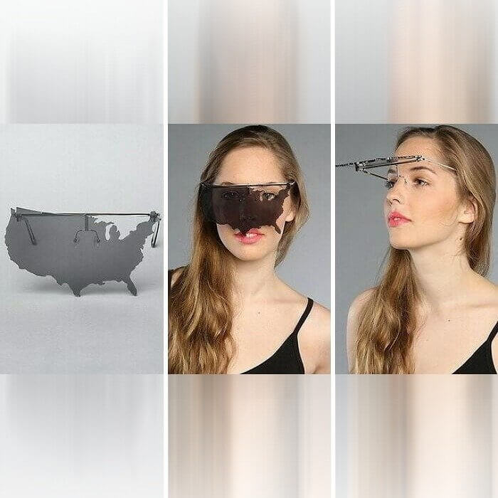
Say hello to the next big thing in designer sunglasses. We're just kidding, at least, we hope. These things don't look remotely practical. We kind of get the idea behind making a pair of sunglasses shaped like the U.S., but in practice, they just don't work. Even the product pictures show that the woman in the photo is just using her left eye normally without the glasses since to the west of Michigan is Canada.
Also, it's kind of messed up that Hawaii and Alaska aren't included. Maybe they could make some matching earrings or a necklace to go with these or something?
The Perfect Bathroom Layout Doesn't Exis...
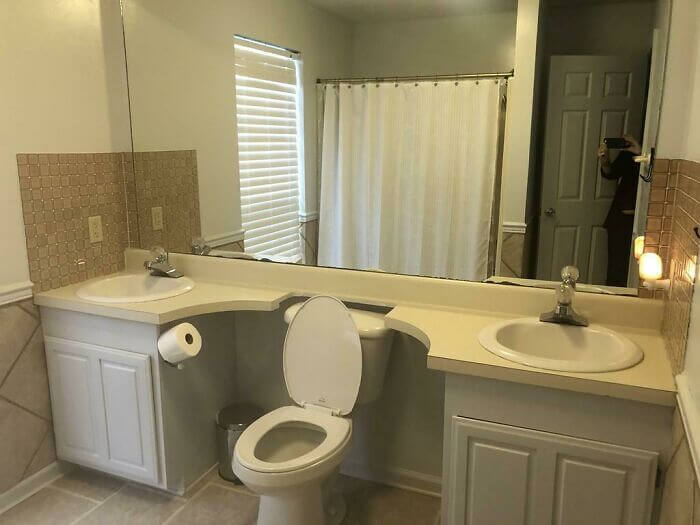
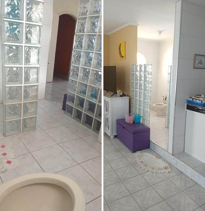
Let's face it; most bathrooms are either too small or just don't make much use of the space they have. Enter whatever kind of layout this is. A designer or architect out there thought it'd be a good idea to place a single toilet between two sinks. And we have to admit; it was a bold move. It's not necessarily a design fail, but it is a bit weird to look at.
It also appears as though that was the only space available for a toilet if the reflection in the mirror is anything to go off of. Although, if they really wanted to they could've just gotten rid of one of the sinks.
A Little Space Here Please
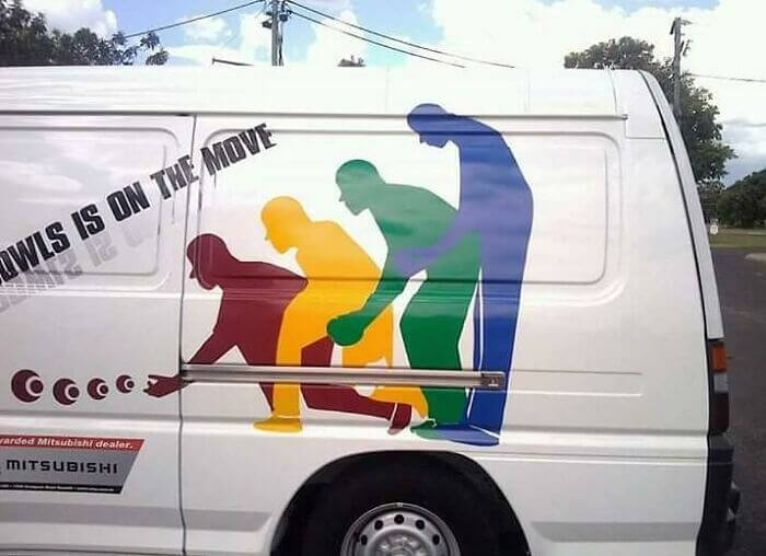
Sometimes an idea seems good in your head, but it just doesn't pan out when it comes to life. The design on this van seems like one of those instances. We see what they were going for, but it just isn't working. They were trying to show the motions someone goes through when bowling, or at least we think they're bowling in this image, but instead, the whole thing just looks like... something else.
On the bright side, the main point of a sign or advertisement is to stand out and be noticeable. We think this design probably achieves that purpose pretty well.
An Open Floor Design
Someone posted this photo online and said that the photo on the right is the first thing someone sees when they walk into this house. Like the other bathroom photo on this list, that's a pretty bold choice. But not in a good way. We couldn't imagine walking into the house only to find someone just right there sitting on the toilet. They don't even have a curtain up or anything.
But that's not the only design flaw here. That step going into the bathroom is sure to trip some people up, especially if they're walking into the bathroom at night.
This Clock Has A Lot Going On
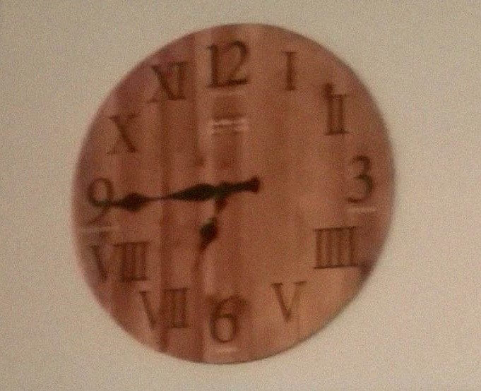
There are so many different things going on here with this clock, and none of them make sense. For one thing, it uses both Arabic and Roman numerals. Why? We aren't too sure. Someone just posted this photo and said it was a clock at their work. There's no backstory, which we're sure would be pretty entertaining. Secondly, the Roman numeral for 4 is IIII and not IV, which actually has a really interesting story behind it.
There are theories that the Romans didn't actually write 4 as IV, since this version sounded like the name of Jupiter, and they didn't want to use his name in vain. However, there are other theories stating that Romans just used IIII because subtracting Roman numerals was an invention of the Middle Ages.
Never Leave Your Couch Again
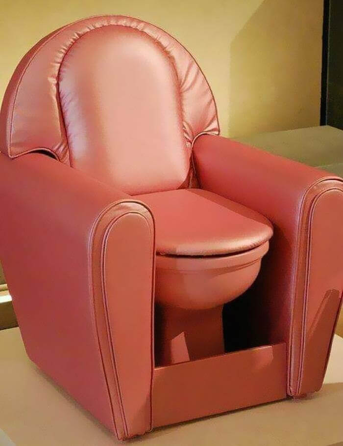
Here's another design that borders on genius and fail. Someone finally decided to combine a toilet and a couch, and this is what they came up with. Add in a T.V. and cooler, and you'd probably never have to leave your favorite seat again. Granted, it's probably not the best option for those who live with other people. That's why we imagine that not too many of these have actually sold.
Still, you have to admire the designer who took what they've probably heard people saying for years and just went with it, even if it isn't exactly commercially viable.
Like Taking A Shower In The Sink
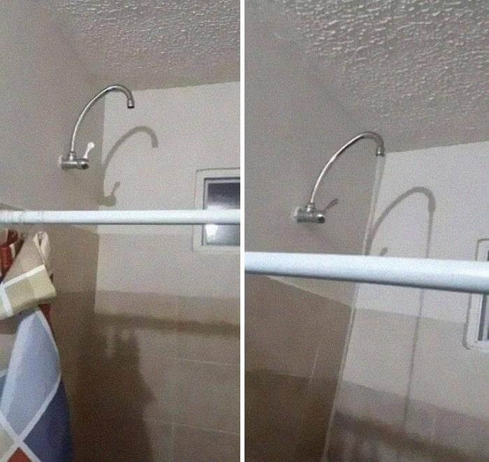
We're pretty sure that whoever built this house didn't add this shower fixture. More likely than not, the owner just replaced it with a faucet after the fact. Still, we're sure they're not going to be enjoying this shower nearly as much as they would if they had an actual showerhead on there. As it stands now, you're just standing underneath a stream of water for an hour trying to get clean.
We're sure that it works; it'd just take a bit longer. Also, imagine taking a hot shower underneath this thing. The water would probably be a bit warmer than if it was coming out of a normal showerhead.
When You Really Need An Outlet
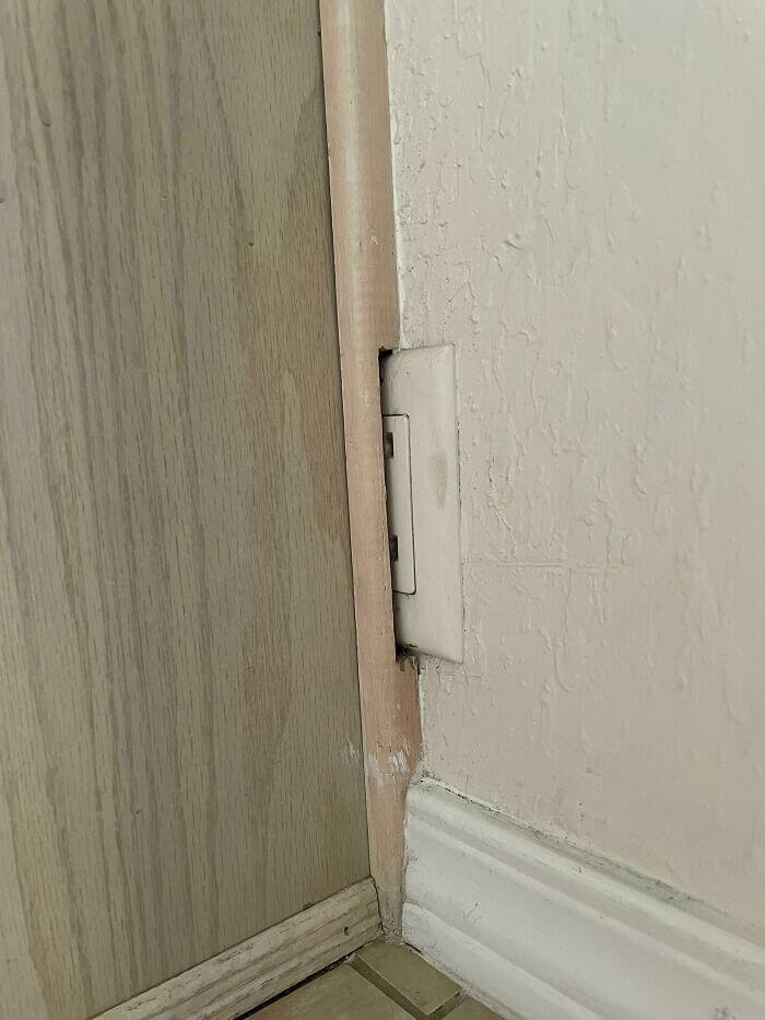
Someone deserves an award for this one. It appears as if maybe the wall blocking the outlet was added later, which would make more sense than if it was just designed this way. Still, someone saw it right there and just chose to place the wall in the middle of it anyway. They even had to cut a notch in the trim so that it would fit over the outlet.
Funnily enough, you can just get blank wall covers at pretty much any hardware store that sells outlet covers. It'd still look a bit funny, but at least it wouldn't look totally out of place.
Get Good Or Get To Replacing Windows
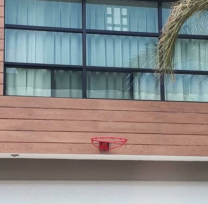
Sometimes, it can be hard to find a place to install a basketball goal, especially if you're installing it on a home. There's always going to be some kind of risk that the ball is going to damage a part of the home. However, whoever installed the goal in this photo probably should've looked a little harder than they did. There's not even a backboard here unless you count the glass windows as a backboard.
If people are using this every day, then we're sure that a couple of windows are going to get broken at some point. But maybe whoever is shooting can just use that as motivation to get good.
A Toilet With A Decent View
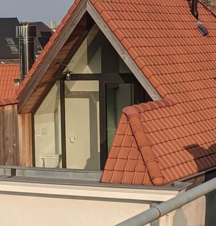
This one kind of just depends on what you view as a design failure. This bathroom, and the toilet in particular, sit on the roof, overlooking whatever is on the opposite side. Obviously, there are some buildings there since someone took this photo. However, we're sure it's also a decent view. Still, you would think that this would be something the homeowner would ask an architect to prioritize. Buildings don't usually come with the toilet on the roof do they?
There also appears to be a little balcony right outside the bathroom, so you can just walk out after a shower and dry off in the sun or something.
To Enter Or Not To Enter?
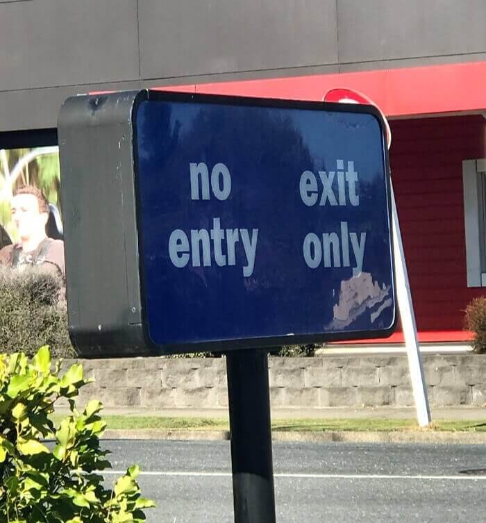
This sign was spotted at Burger King. And depending on the way you read it, the sign can have a couple of different meanings. If you read it left to right and top to bottom, then it just says, "no exit, entry only." That seems easy enough. However, if you read it top to bottom first, as the spacing would imply, then it reads, "no entry, exit only." You can see why someone might get confused.
The sign is all at once an enter sign and an exit sign. Whoever designed this probably didn't have a lot of space to work with, but still. It could be clearer.
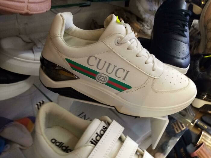
Name Brand Cuucis
Firstly, we know these are knockoffs but we can still fault the designer. They're supposed to resemble Gucci shoes. However, whoever designed them spelled it Cuuci, which isn't a real brand first of all, and sounds like something totally different than Gucci. Depending on how you choose to pronounce it, they can sound like "kooky" or another word that we're sure anyone reading this has already said in their head half a dozen times.
And all of that falls on whoever designed these knockoffs. Yes, they're knockoffs, but you still want them to look as similar as possible to the real things, and that includes the text.
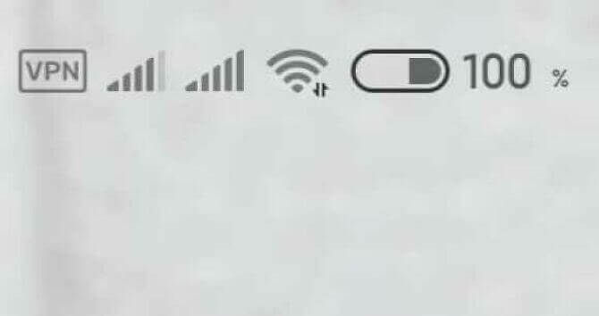
Without A Doubt, Fully Charged
We're not really sure what is going on in this photo. For some reason, the charge percentage says 100%, but the bar itself looks like it's around about 75 or 60%. Then again, we could be entirely wrong, and that bar could be for something else. However, that's the issue with bad design; it just leaves you guessing and not really sure about things. You would think a phone manufacturer would have it all figured out though.
There's also another possibility here. Maybe the charge percentage actually goes up to 200% for some reason, and it's totally accurate in this photo. That would be the only explanation that would actually make sense.
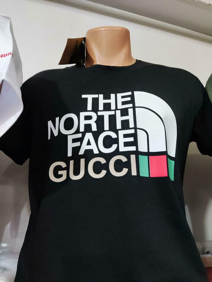
Collab Or Knockoff
This might come as a bit of a shock, but this shirt is the result of an actual collaboration between North Face and Gucci. This isn't actually a knockoff, as some of the other shady clothing items on this list are. However, we actually had to Google that this was a collaboration and if people have to Google that, then you might want to change your design up, especially for a collaboration.
These two companies literally just added one of their names underneath another and changed a few colors, and then called it a collaboration. We though collaborations were supposed to blend styles and lead to unique, interesting designs.
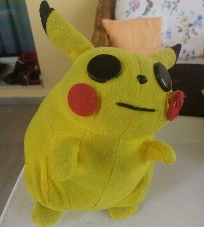
Pikachu Has Seen Better Days
Someone posted this photo online, saying that their Pikachu doll was poorly designed. We don't quite think so. It looks a bit rough, and it doesn't entirely look like the same character we all know, but it's not as bad as some of the other designs on this list. That said, it does look really creepy for some reason, but then again, don't most dolls look creepy in one way or another?
This one just looks extra creepy because it's a stuffed animal of a fictional monster. Just keep this guy away from whatever chewed his face, and he'll be fine.
A Wiper With No Window
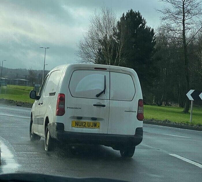
You always need to be prepared, right? Well, that's not exactly the case here and this van could've definitely done without a rear window wiper. There's no window to wipe, as it appears it was covered with a wrap. Funnily enough, it looks like a driver recently tried to wipe the rear windows because you can see where it removed some of the dust on the back windshield. It also looks like it just rained wherever this photo was taken.
So, this one isn't entirely on the designer. Instead, it's on whoever decided to have the back window wrapped and left the wiper there. Although, it probably would be more trouble to remove it than what it's worth.
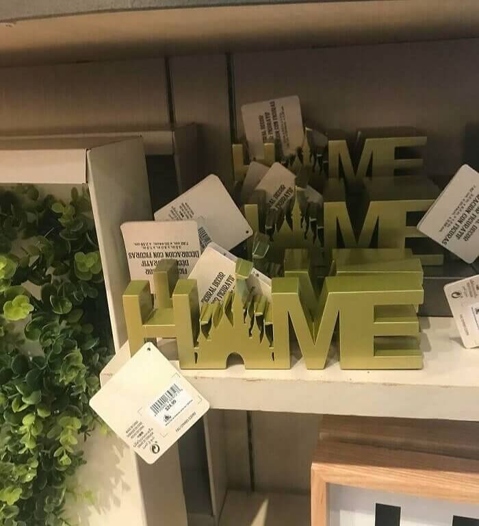
Welcome HNME, Or Is It HNIVE?
This cutesy home decor sign is supposed to spell out "Home." However, it's not exactly clear what the entire thing looks like or what it spells. It looks kind of like it's spelling the words "HNME" and "HNIVE," depending on how you look at it. the tiny castle also kind of looks like a house that's on fire, which isn't the most pleasant thing to come home to after a long day at work.
Either way, it definitely doesn't look like what it's intended to look like, which is why it's on this list of design fails. Sorry Disney castle, or Red Square, whichever one you are.

