The Striped Staircase
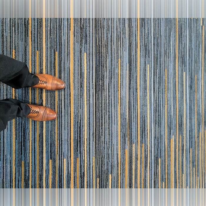
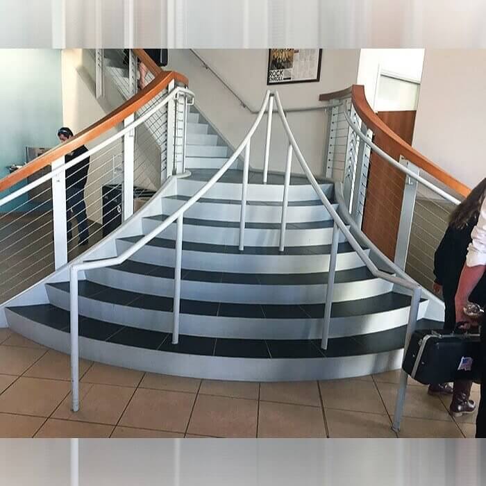
So at first glance you might think that this isn't actually that bad of a design. And while, objectively that may be true, once you realize that this is actually the carpet choice that was given to a staircase, you will probably change your mind. The stripes themselves aren't that bad, and can actually be a pretty decent design choice, however when you put them on stairs it just leads to confusion.
There have probably been countless people who tripped or almost tripped as a result of these striped stairs that are very confusing to the eye.
When You Have a Mirror Ceiling in the Bathroom
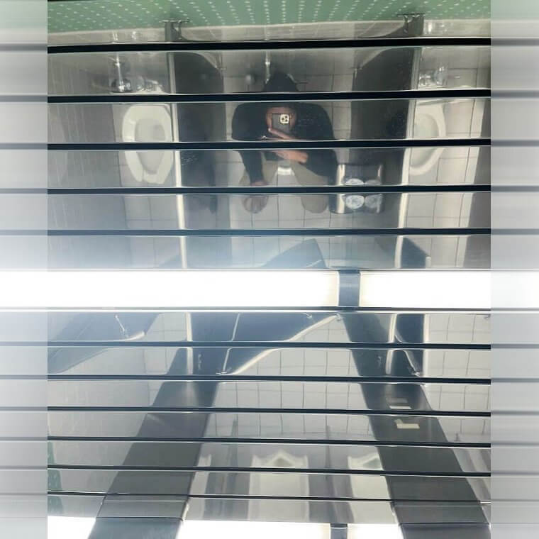
While there are certainly places where a mirrored ceiling is a perfect design choice, perhaps everyone can agree that the bathroom is not one of them. Besides the fact that very few people want to watch themselves as they go to the bathroom, they probably want to watch their coworkers going to the bathroom even less. It must be pretty awkward to go to the bathroom at this work place.
They might as well treat that bathroom as if it is only for one person. Imagine just trying to do you business and then accidentally looking up and seeing the reflection of your coworker in the mirror.
The Hairy Hotel Lobby Artwork
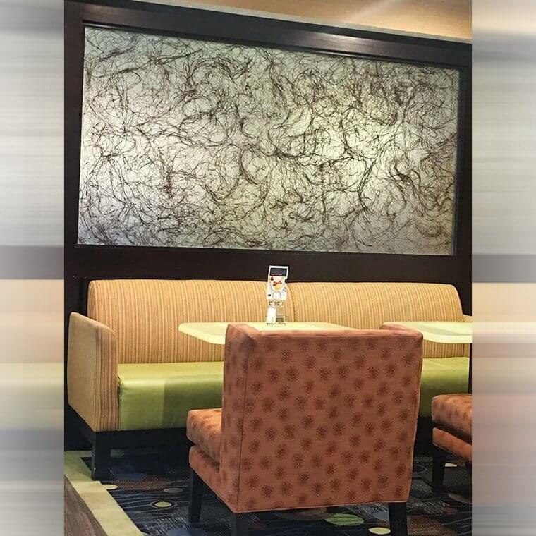
Of course art is subjective, however, there are some pieces of art that probably should not be chosen as the face of a business. When you walk into the lobby of a hotel, the last thing you probably want to see is something that looks like a million little black hairs. After all, that isn't exactly the experience you are hoping will translate to the stay that you are going to have at the hotel.
It seems like whoever designed this hotel lobby was a bit oblivious to the fact that this piece of art might be a little bit controversial.
When You Just Wanted Tacos but Got a Wood Plank
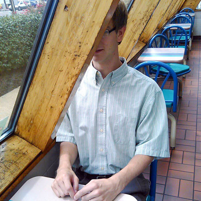
There is nothing like going to your favorite restaurant and sitting down for a nice meal. You know the food is going to be good and you are filled with excitement for the moment to come. This man had that moment of excitement as he approached the table at this taco restaurant. However, the excitement was quickly shrouded by something else....the massive wooden plank that was in his face at the table.
Maybe no one realized that if someone sat at the table then they would most likely be faced with a big plank to the head instead of a nice view of their partner. Maybe this table is meant for solo diners.
The Sink That Is Actually Just a Slab of Marble
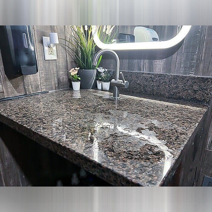
Who doesn't love marble in the bathroom? While most people general, it is more loved if it is used to build the correct shape for the purpose. This bathroom's sink, while it does look chic, is not very functional at all. There is no groove or drainage whatsoever. When you turn the faucet on, the water just falls off the edge and onto the floor of the bathroom.
That cannot be a convenient way to have a bathroom constantly. Although it was probably just a mistake from someone who built it, it probably should be fixed.
A Chandelier of Knives
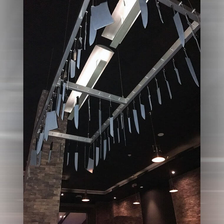
While people really love to create interesting chandeliers and they can be made out of a plethora of different materials, there are some things that really shouldn't be used for something that will hang over the heads of innocent people. And one of those taboo items is definitely knives. Not only would most people be uncomfortable sitting with a whole slew of knives over their heads, but the owners of the business should also be concerned.
Those are not small knives either. If even one of those fell anywhere or at the wrong time, there could be some serious damage.
A Lamp in the Face
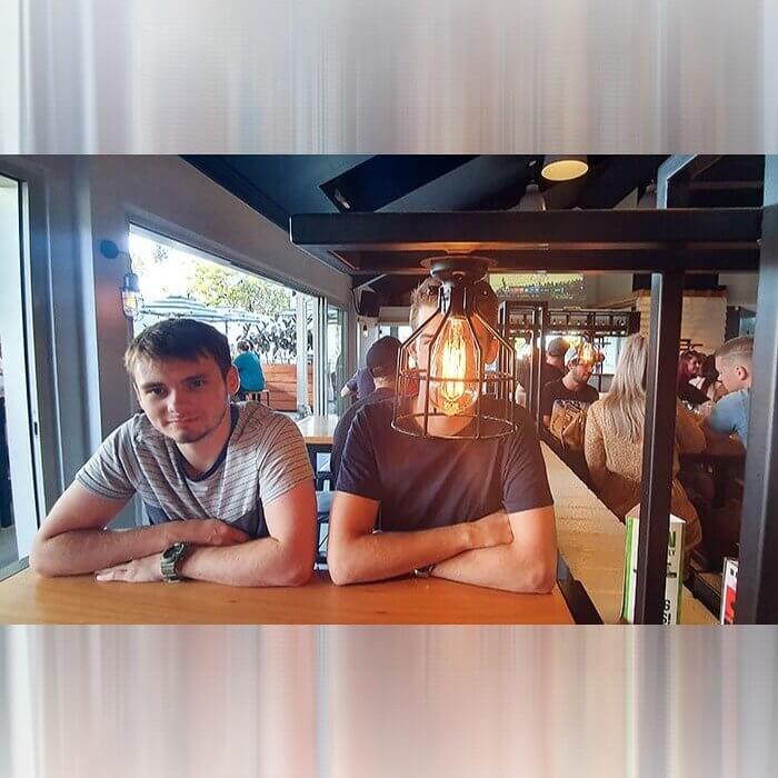
In case you were ever wondering what it would be like to have dinner with a lamp, your opportunity has arisen at this restaurant. Now you are lucky enough to have a seat right in front of a lamp. You might want to bring sunglasses if you think that yiu might have to sit at this spot in the restaurant. It will be hard to avoid that sort of lighting.
It just seems that someone did not think through their lighting choices when it came to designing this restaurant or bar. They forgot that people would actually be sitting at the tables.
Just a Streak of Red
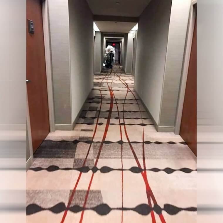
Although a streak of color is usually a good thing when it comes to design, that is not always the case, as can be seen with this interior design choice. For some reason the people who designed this hallway forgot that red streaks on the ground will usually look like blood to most people who walk by and that it's not just a nice pop of color to add to the ground.
It really looks like something that was bleeding was dragged across the carpet. Almost no one would think that was an intentional design choice.
A See Through Door in the Bathroom
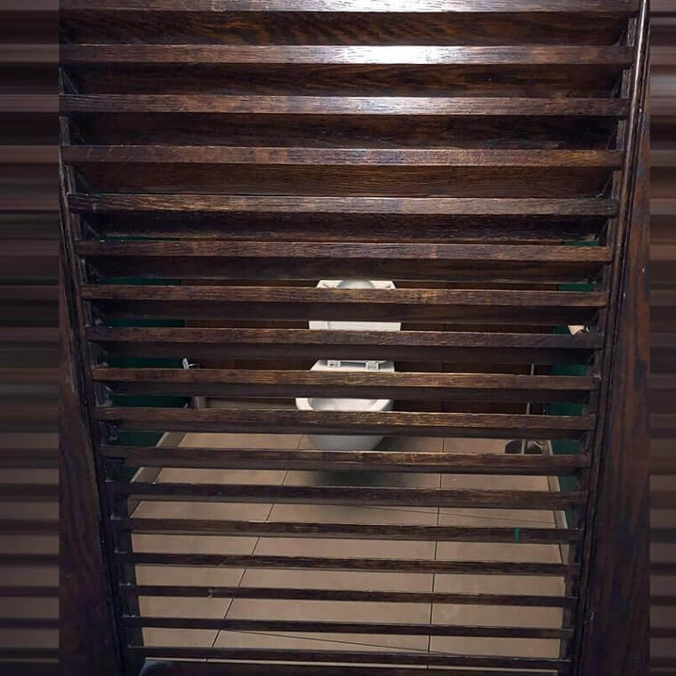
If you were to ask people what the main purpose of a bathroom is, then they would probably tell you that it is to stay private. While most places do provide that and there is no way that you can see inside the stalls, this bathroom seems to be an exception. They decided that the right choice for this bathroom was a door that has slots of wood that you can see through.
You can only hope that there is another door that would protect people from walking in and watching someone do their business.
When the Seats Don't Match With the Desk
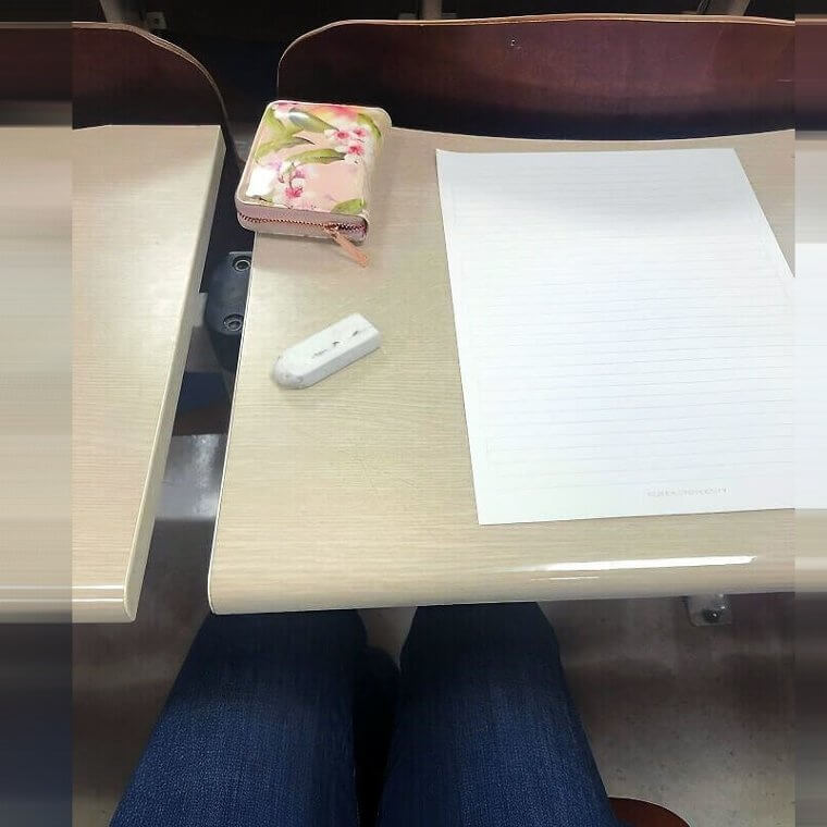
If you are someone who struggles with OCD or even minor versions of it, then this picture will make things even worse. These are the desks that students have to use when they go to class. At first glance, they may seem pretty normal, however, take a look at the seat and you will think otherwise. The seats and the desks do not line up at all. And do you know what the irony of it all is?
The irony of this all is that these are the desks and chairs in one of the engineering buildings. There is something just extra comical about that.
The Worst Place for a Door Handle
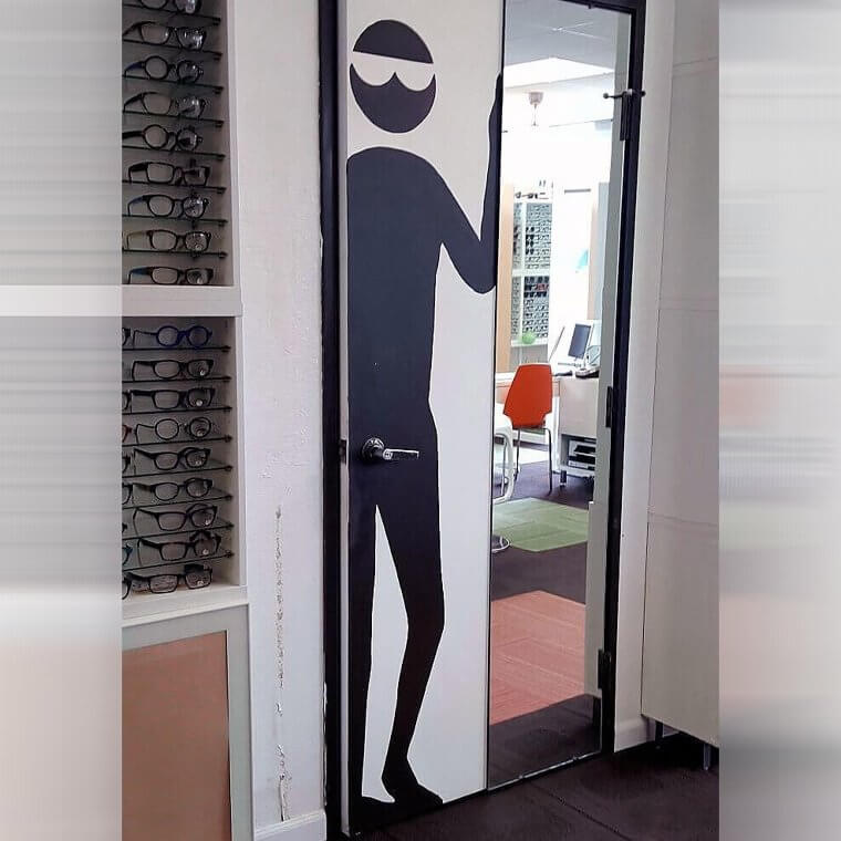
Now this is either genius or horrible, there is no in between. Someone either thought this was the funniest thing of all or they just simply missed it somehow entirely. In case you weren't sure what is wrong with the photo, then just take a closer look at the placement of the door handle. People would probably feel uncomfortable using that on a day to day basis. It may feel a bit strange.
The worst part about this is that this appears to be part of an office building, so people have to utilize this in a professional setting very often.
An Attempt to Make It Chic With a Chandelier
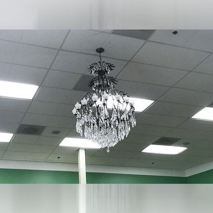
Well you have to give the designers of this room a bit of credit just for the effort. While most people would just leave the ugly fluorescent lighting and boring ceiling tiles to do their work of lighting up the building, it looks like someone wanted to improve things a little bit (or at least attempt to). And so they stuck a full chandelier in the middle of the room to liven up the atmosphere.
It might look a bit silly at first, however, you have to give them an A for Effort. After all, they were at least trying to make it look a bit more aesthetically pleasing.
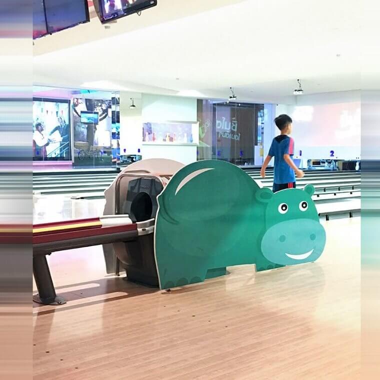
Bowling Balls That Come Out of the Back of a Hippo
Bowling can be really fun, but it is usually a pretty straightforward game and sport. After all, there isn't too much that can be done to change up the decor at a bowling alley...or so you probably thought. This bowling alley in Bangkok decided to make things more interesting by adding in a little bit of decorations. It is not really clear, however, why they chose a hippo for this.
The funniest part about this decor choice is that they made sure that the hippo was facing in the direction that the bowling balls would be coming out of the hippos back end.
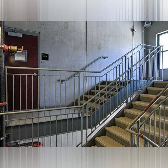
An Excessive Amount of Stairs
If you are not a lover of stairs (as most people are not), then this is not the building for you. This building seemed to have made a little mistake when they did the design. After all, it doesn't really make much sense that at any point you should have to go up the stairs and then down the stairs just to get to the door. It is a totally unnecessary climb and descent.
They should have just made a direct pathway to the door from the level before...or a smaller set of stairs and then just remove the extra hallway area.
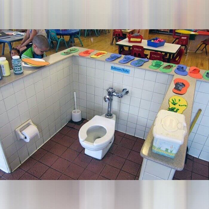
A Toilet in the Middle of the Classroom
Ok so now this one is beyond just a bad design choice, this one is actually on the unsanitary side. In this classroom, children at least have a toilet right nearby so that there isn't any issue getting to the bathroom, however, it is open in the middle of the room. Children getting their snacks are right next to the toilet and there is absolutely no privacy at all for the bathroom goers.
It must get pretty smelly at times and it also must be pretty embarrassing for children that have to go to the bathroom and it might make some noise or cause smells.
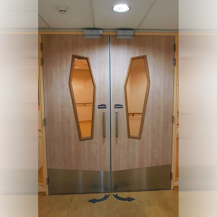
The Worst Door Design for a Hospital
So context is everything when it comes to the doors at this hospital. After all, the last thing anyone wants to be reminded of in a hospital is death, which is why it was really a poor decision to have doors that are shaped very similarly to coffins at a hospital. While this may be a funny and sick joke at a funeral home or similar place, it's probably not the best choice for a hospital.
Do you think this interior designer just had a very dark sense of humor? Or do you think that completely missed the resemblance and had no idea what this looked like?
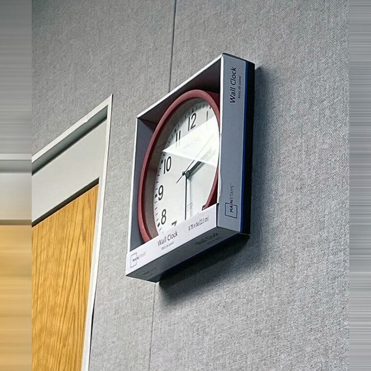
They Forgot to Take It Out of the Box
Maybe this was an attempt at a hipster-like piece of artwork in the form of a clock, or maybe it was just laziness. The answer will probably never be known and all that is left is to discuss the piece itself. It is funny to see a clock on the wall that is still in the box, but it also does somewhat look like a piece of artwork hanging there.
The real question is how did they manage to hand it up with the box, did they just pock a hole in the cardboard itself and then hang it up?
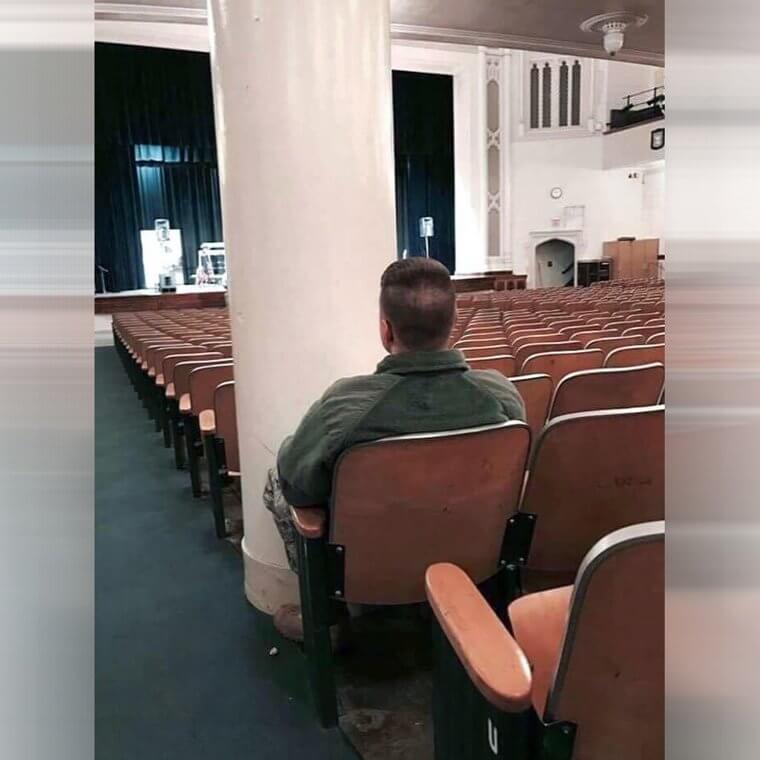
The Seat Behind the Pillar
In an auditorium there is one main thing that is important...to be able to see what is going on. While some could argue that it is also important to hear (and that is also true), it is probably a bit more critical to be able to see what is being performed. That is exactly why the placement of this pillar is so questionable and so funny. It is blocking the view entirely.
Whoever is unlucky enough to get this seat is in the worst position. While it also blocks most of the sight around, this is the worst spot.
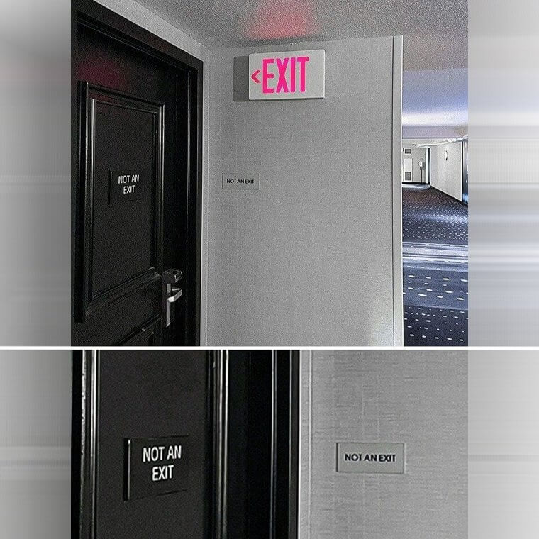
Is It an Exit or Not?
If there was ever an emergency situation in this building then things could get pretty confusing. Things can probably get pretty confusing for people in the building even if it's not an emergency. After all, there are some conflicting signs and it makes it a bit difficult to figure out where to go. Is it an exit or is it not an exit? It is hard to know and hard to find out.
You can only hope that there are plenty of people who work in this building who know where the actual exit is so that they can direct people.
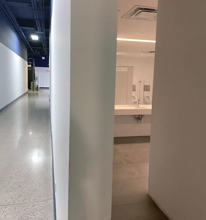
Urinals in the Main Hallway
Have you ever wondered what it would be like if there were just public bathrooms for all, with no privacy in the least bit? Well, here is a little glimpse into that life and horror. The entrance and the mirrors that were placed in the design of this bathroom don't seem to be particularly well thought through. After all, everyone who walks in the main hallway of this building can see people using the urinals.
It must be pretty uncomfortable to walk by this sight every day. A certain portion of the people probably take a look while they also try to look away.
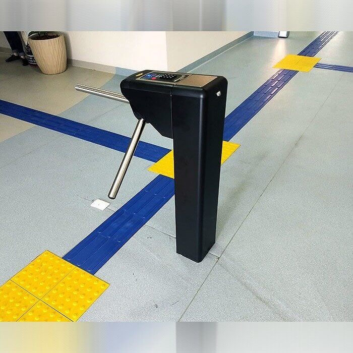
It's a Ticket Gate Without a Gate
Despite the name of this contraption...a ticket gate...it appears that there isn't really a gate to accompany the ticket gate portion. While you can always hope that people will still scan their tickets upon entry into the next room, there is no way to guarantee that as there is no gate to keep people out unless they pass through the scanning area. It seems like a pretty useless contraption at the end of the day.
If anything it seems like something that would take up space since it appears to be a bit on the unnecessary side.
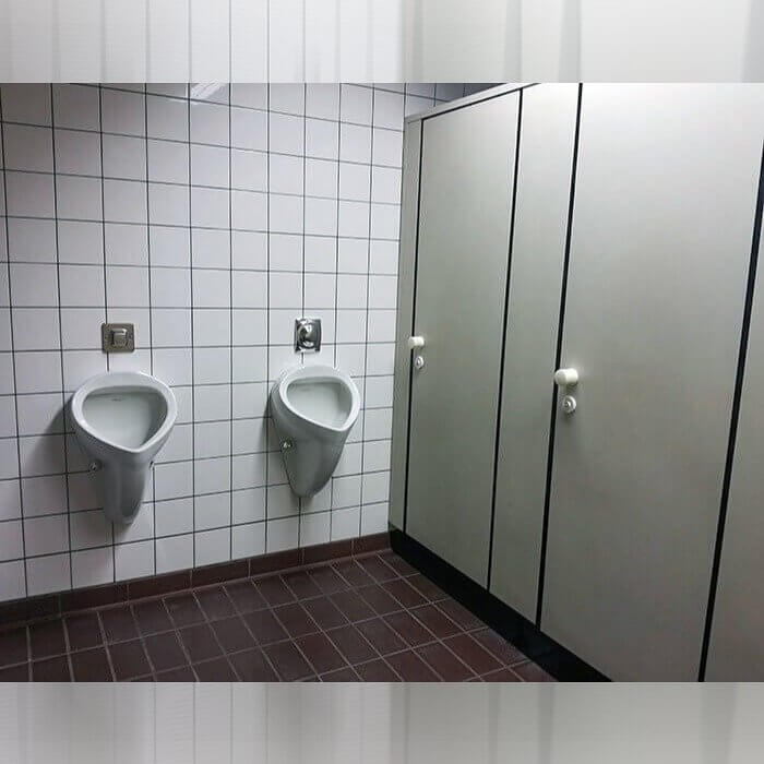
When the Urinal and the Toilet Are a Little Too Close
At first glance you may not be able to spot exactly what the issue is in this bathroom, however, once you find it, you will be wondering what happened. Did you spot the issue yet? It's only that if someone is using the bathroom stall on the left and then someone comes in and uses the urinal on the right, there may be a very uncomfortable clash in the works.
Either the guy at the urinal will be hit by the door or the guy in the stall will be stuck there until the guy at the urinal is done.
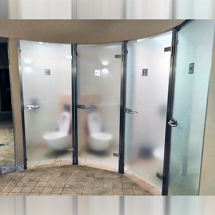
When the Bathroom Stall Doors Are Semi-Transparent Bathroom
There seems to be quite a few bathrooms on this list that just didn't pass the privacy test for design. It seems like some people don't think that privacy is the most important thing when it comes to the bathroom, but the people who have to actually use this bathroom might disagree. It looks like the people in this office building probably will avoid using this just to save some dignity.
Perhaps the worst part about this is that it is placed in what seems to be the absolute center of the room, it is not even in a back hallway or anything, like the bathrooms are on display.
Lucky Enough to Have the Locker With the Pipe
Well it seems like someone in this school was bound to be pretty unlucky in that they were going to be the ones that were stuck with the pipe locker. Assuming most of the lockers in the area don't have pipes running through them, this young man got one of the ones that did. It is interesting though that there is even one locker that can be assigned that has a massive pipe running through it.
You can only hope that this boy was given a new locker once the school figured out what had happened and that he wasn't stuck with this useless locker the whole year.
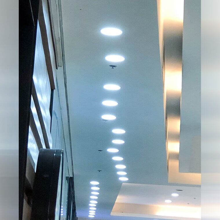
The Lights Are All Over the Place
While most people probably think that it is important to make sure that things line up in a straight way, it seems like the designer of this hallway did not think that was important. Either that or maybe they didn't have a way to measure everything properly. Either way, somehow the lights ended up in a very crooked and in a caterpillar like shape that is confusing to look at.
If you look at all of the lights it appears that they were not really able to make any of them in a straight line. But was it on purpose or an accident?
The Most Confusing Elevator in the World
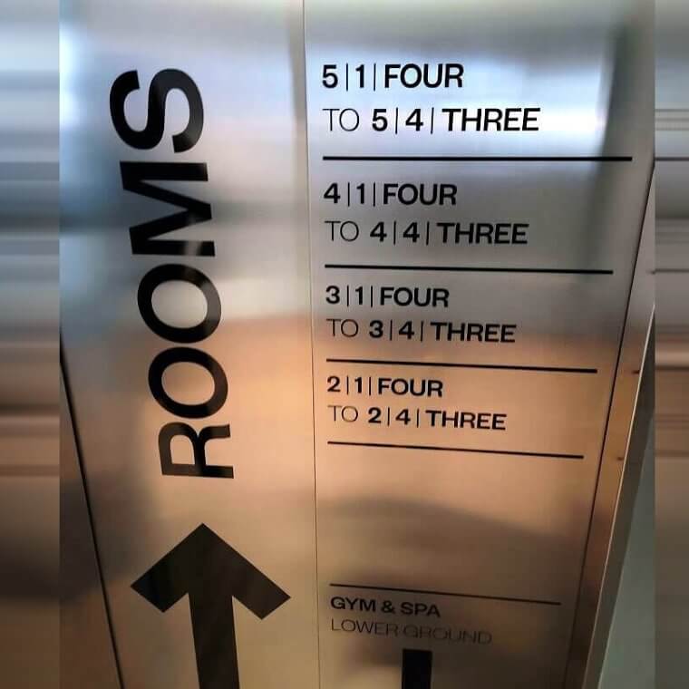
If you ever want to visit the most confusing elevator in the world, then you should book a night at this hotel in Iceland. Even after looking at this for a long time it is hard to figure out which floor is for which rooms. Which numbers correlate to which the floor and the room? It is very hard to understand and even harder to follow. You can only hope for the best.
This is one of the circumstances where it seems that they need a doorman to help the guests understand where they are supposed to go and how to get there.
Cutting the Mirrors in Half
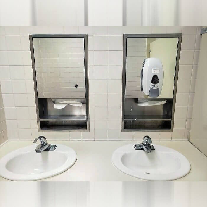
It can be tricky to figure out how to fit everything that is needed in a bathroom into a small space. Sometimes you need to cut corners, or in this case, you need to cut mirrors. These people cut the mirror in half so that they could fit the soap dispenser and the paper towels. This seems like a strange choice though, when there is space in between the mirrors.
There isn't a whole ton of space in between the mirrors for these things, however, there is enough for them to fit at least some of the items so they don't have to cut the mirror in half.
Urinals in Very Close Quarters
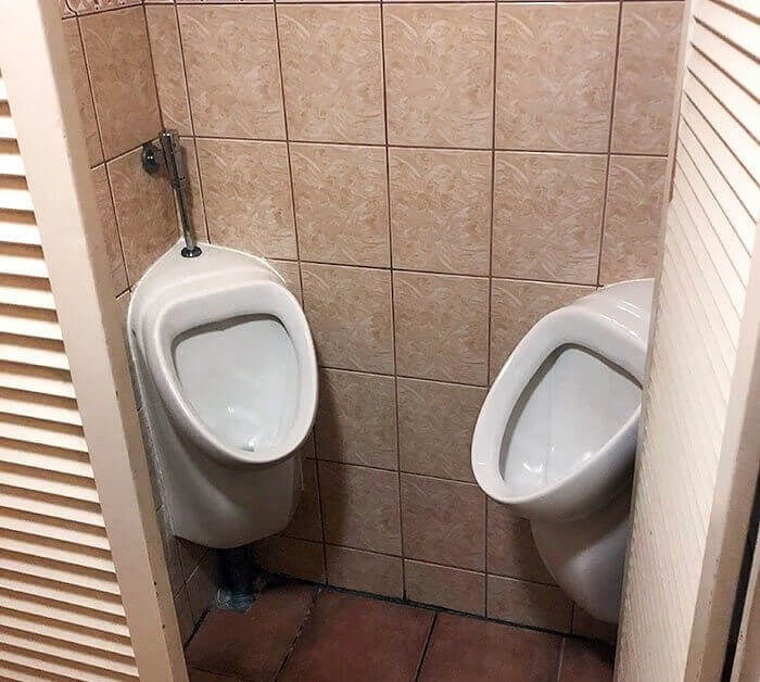
Continuing the themes of bathrooms that would make anyone uncomfortable, you are presented with one of the worst ones yet. Pretty much everyone can agree that this is almost a nightmare situation if there are multiple people using the urinals at the same time. Very few people would be comfortable with their bum touching the bum of a complete stranger as they relieved themself in a public urinal of a restaurant.
Imagine if Germany was the first foreign country that you visited and this was the first restaurant that you went to. You would probably think it was a pretty crazy country and culture.
Just a SpongeBob Stained Glass Window
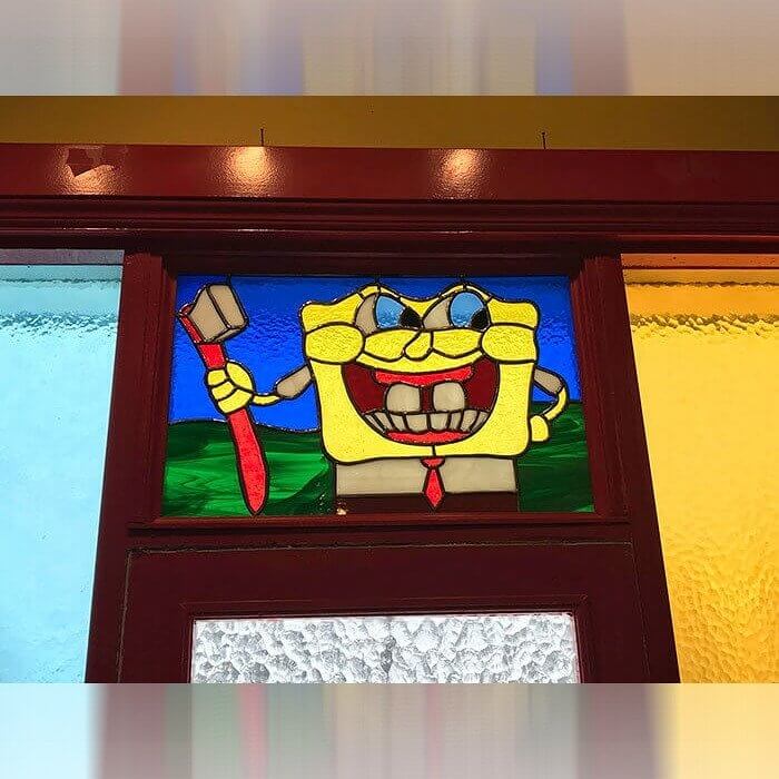
While most of the items on this list are examples of some pretty uncomfortable, confusing, or awkward, this one had more potential of being cute. After all, kids especially probably really like to see stained glass images of SpongeBob if they have to look at something while their teeth are being done. However, the issue here is that SpongeBob is missing quite a few teeth which maybe isn't the best look for a dentist.
Maybe the dentist had this installed specifically so that they could see what would happen if they didn't brush their teeth regularly and execute proper teeth care.
Self Service Kiosks That Are a Little Low
Most people are pretty excited to have self service options when they go to their favorite restaurants. It often speeds up the pace of things, reduces the need to wait, and helps people who have social anxiety order some food. This Taco Bell was trying to get current with the times, however, they seemed to forget one of the most important aspects of these kiosks, user friendliness for the customers.
Unless this Taco Bell's main audience is young children, this probably was not the best choice for this restaurant as everyone would have to bend or crouch down just to use them.
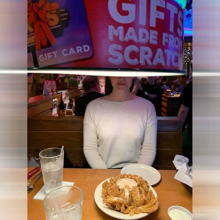
A Booth Without a View
There is nothing quite like going out to dinner with someone and not being able to see the person that you are sitting across from. Unless this is a new attempt by some people to keep some mystery for people going on first dates, then it is a pretty big design fail. But maybe people like to use a place like this to make for a funny story if they go on a date.
Maybe the people who designed this were on the shorter side...or maybe they assumed everyone sitting there would be a child so they wouldn't reach the blocking point.
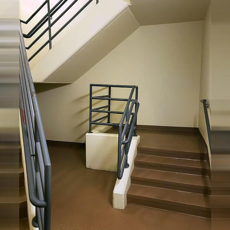
The Stairwell That Leads to Nowhere
Ahhh there is nothing quite like a stairwell that leads to nowhere. It seems like this is more of a waste of space than anything else. Now that there are the stairs that lead to nowhere, they can't really even do anything with the space. What was this little platform made for in the first place? It would be very interesting to know why someone thought this was beneficial at all.
At least people who like to create unique designs could do something fun and interesting with a space like this. They could make a little area to eat or a tiny little shrine for a cat.
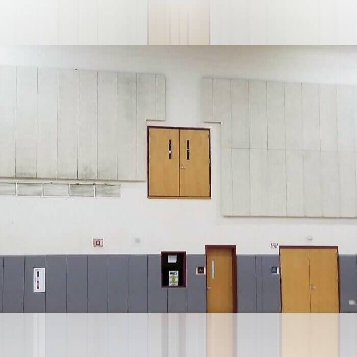
An Impossible Gym Entrance
Gym class is really unlike any other class that kids take in school. Some children love it and think that it is the best class while others think that it's the worst one and they wish they never had to take it. However, there is no doubt that people will be pretty aligned when it comes to the comical aspects of this gym entrance. It is nearly impossible for anyone to reach that entrance.
Where do these doors lead? Is it a secret closet or are they just doors that don't actually open or have anything behind them?
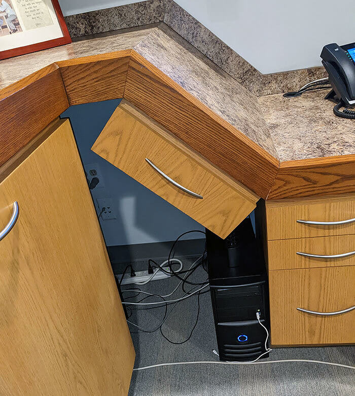
The Strangest Drawer You Will Probably Ever See
If you ever wanted to see one of the strangest desks that were ever designed, then you are lucky enough to be presented with it right now. After all, it doesn't get much stranger than this...a drawer that is built on a slant and hardly has any function at all. The interesting aspect about this is that the drawer does actually work somehow, although it looks pretty strange and doesn't seem like it would work.
It almost seems like it would have been better if they just left the entire area empty instead of attempting the strange single drawer built on the side.
Is It a Sink or a Urinal?
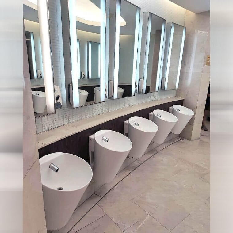
It's hard to tell when you first look at this bathroom design if it is a very nice and chic bathroom design or just one that went entirely wrong. It seemed like they were trying to do something nice and interesting, however, it turned against them. Instead of being chic and pretty it turned into a question of whether the sinks are sinks or if they are actually just urinals.
After all, they are quite low to be sinks and they are more on the level of a urinal, all the while being white, it makes sense that people would be confused.
One of the Most Confusing Clocks on Earth
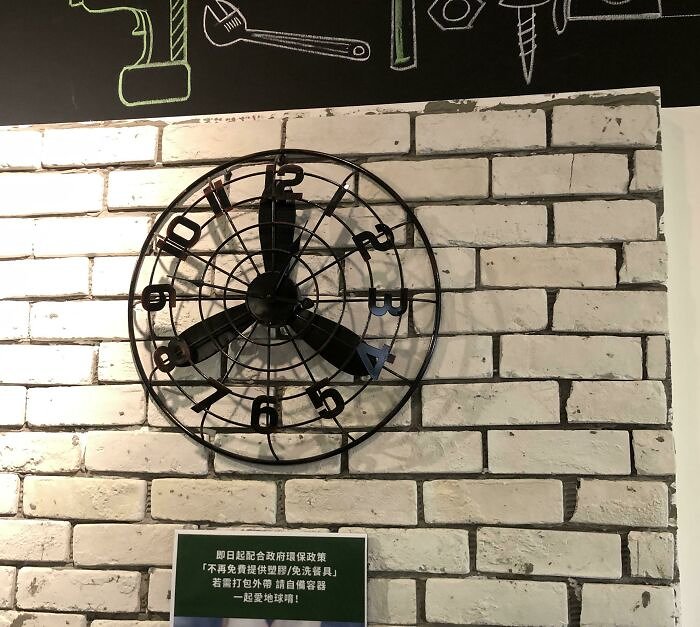
Using a fan to create a clock is a pretty unique and interesting idea. It looks creative and chic on the one hand, but on the other hand something went wrong and they forgot that a clock is only supposed to have two hands. They needed to remove the third part of the fan from the "clock" if they wanted anyone to be able to be able to actually tell the time.
Well, even if no one can tell the time with this clock, at least it looks nice as a decoration piece in the place.
Taking Public Restroom to the Next Level
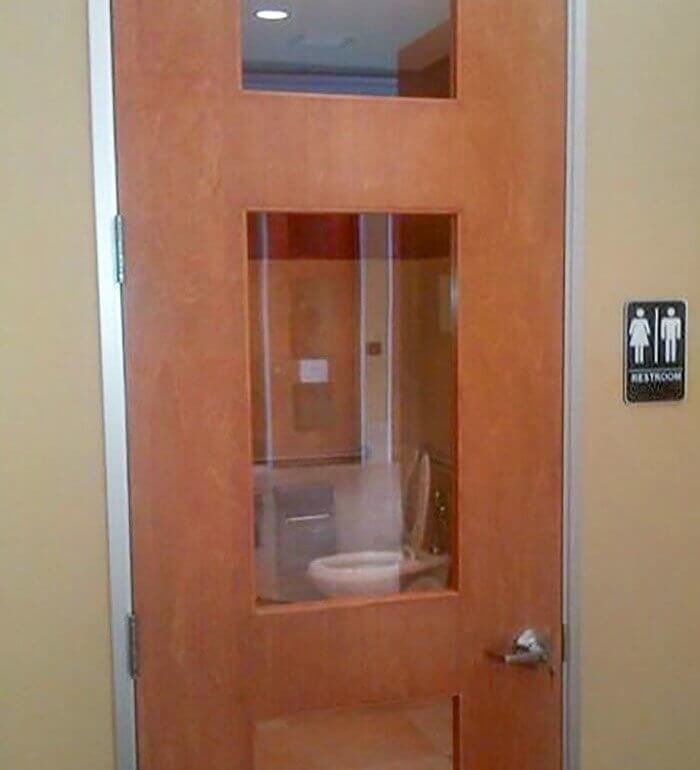
It looks like some people decided to take the phrase "public bathroom" to the next level. While most people think that it means "bathrooms that are meant for the public", it seems like this interior designer decided that it meant "bathrooms that are public to the public". It would take a very brave person to be able to use this bathroom when they know that anyone can see them.
You probably would have thought that someone would at least think to put a curtain there to give people some privacy. While it may have been an initial mistake, it is one that could be fixed pretty easily.
When the Projector Blocks the Screen
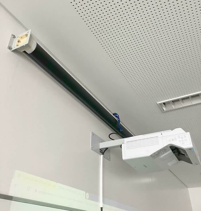
People who grew up in schools where they used projectors and screens in order to share slides on a big screen know and can understand just how funny this mistake is. The person who installed this screen and projector made a pretty critical mistake by mixing up the order of which belongs on top of which. And now they cannot use the screen at all as the projector is blocking it.
It looks like there is no way to use that screen and there is no way to utilize the projector. It seems like a bit of a waste and maybe a mistake that could be fixed.
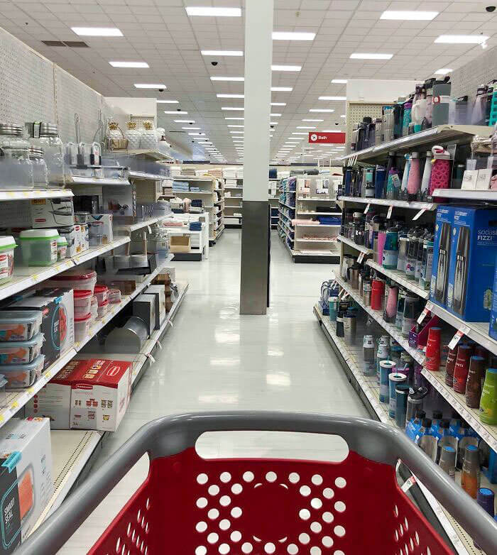
When the Cart Can't Get Through the Aisle
It seems funny that there are stores where people have carts and aisles that are regularly used by customers and yet the carts don't really fit through the aisles. It looks like this isn't a common occurrence, the location of this pillar, however, it must be a bit inconvenient for some people. Luckily the aisles aren't actually that long so they could just turn around before it was too late.
It does seem like there is enough room for people without carts to get by and not everyone uses carts, so while it's not ideal, it is also not that bad.
Avoid the Middle Area of the Stairs
While it appears that the person who designed this public stairwell was trying to make an interesting design choice, in all reality they ended up making a mess of things. You can only pity the person who doesn't anticipate the end of the middle section and accidentally walks up the center area. They will be stuck in an awkward situation where they have to do the walk of shame and turn around and head down the stairs.
They probably could have done with just one railing down the center of the stairs.

